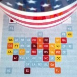
The states in the USA are all over the map when it comes to total area (aka, “size”).
We all love data visualizations on maps, but the wide range of state sizes can distort visual messages.
Smart graphics for visual people
The states in the USA are all over the map when it comes to total area (aka, “size”).
We all love data visualizations on maps, but the wide range of state sizes can distort visual messages.
 Are you interested in data visualization, presentation and graphical representations?
Me too!
I spent this morning playing around with various visual forms, to see how well they convey information. You might enjoy my mini-study, and like to share your own opinions on the matter!
 Are you looking to create data-visualizations that relate to the people in your audience?
Are you sick of pie charts and other boring graphics?
Then you will be interested in the “Visio Village Diagram Template”, which helps you to illustrate data with a human touch.

Tweet, tweet! Twitter is getting REAL BIG. No one is sure exactly what it is or…why. Attention deficit disorder gone nuts? The best source of at-the-moment trends? Customer data goldmine? Are we turning into chirping birds?
And all across the net, it’s raining word clouds! Clumps of words, where each has a different font-size or color to emphasize importance or frequency. Arranged this way and that to fill up the space, or to make a cool design. You’ll see them on blogs and on data-visualization sites everywhere.
Recently, occasional Visio-poster and creative guy in-general Saveen Reddy sent me an e-mail informing me that he had brought Twitter and Word Clouds together in the Visio arena.
 The last time I flew the Amsterdam to Seattle route on Northwest Airlines, I noticed an interesting graphic while trying to figure out how to watch a movie with the in-flight entertainment system.
The graphic showed a clever way to squeeze more steps into a gauge-graphic without using more space.
Of course I couldn’t resist turning it into a Visio SmartShape. You can download it here and use it your presentations and documentation to show ratings, status, priority or other relative data values that will pop off the page when illustrated visually!
[Read more…] about Turn It Up With the NW Airlines Volume Gauge!
 I was reading What goes up, must come down! on the Sankey Diagrams blog and it got me thinking about a radial presentation for Sankey diagrams.
Is there a case or need for radially-oriented Sankey diagrams? Is this something the world needs?
 A Sankey diagram is an interesting visualization that uses the thickness of arrows to depict the flow-volumes in a system. The thicker the arrow, the more flow of energy, mass, or volume. Sankey graphics are easily read and quickly comprehended.
In this article, we’ll explore the creation of Sankey diagrams using Visio, and we’ll offer our own free Visio Sankey diagramming shapes for your downloading and diagramming pleasure!