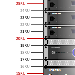
 Find out how to use this new shape to measure and label individual rack units on network rack diagrams.
2016.05.23 – The full version and free trial are now available!
Notes 2016.05.23:
- If you’ve been following along the past few weeks, you can get a free trial or the full version of the product HERE.
- What remains to be done is prefixed with TODOs in-line, along with these biggies:
- TODO: update some of the screen shots to support new features.
- TODO: add one or two instructional videos
I’ve just released a new product that I’ve been working on for several months. As you can guess from the title, it’s called the Über Rack Unit Dimension Line, and it takes the old Rack Unit Dimension Line to a whole new level!
Introducing the New, Über Rack Unit Dimension Line
The primary motivation for creating this shape was to create an “über-class” Visio SmartShape for labelling and measuring rack-unit slots on rack equipment diagrams. You can choose a variety of tick-mark styles and text locations. You can configure prefixes, suffixes, starting values and steps for the tick text.
But the shape can be used to measure and label any linear scale. You can make an inch or centimeter ruler. You can create a “horse hands” scale. The shape is fully configurable and quite versatile.
In the following article, I’ll talk about the history of these “RU” shapes, describe all of the features of the new shape, how to use the shape, and show-off some non-rack-unit uses as well.
There will be a free version of the shape that has all of the features of the full version, but with a limited number of tick marks. The full version will include shapes with 50, 100, 200 and 400 tick marks so that you can best match shape-performance to your diagramming needs.
Rack Units Whence and Whither
Many years ago, I published the old Rack Unit Dimension Line. It could count discrete units of measure, such as Rack Units, which are 1.75″ (inches) in length. While Visio’s dimension line shapes do a nice job of reporting inches, centimeters, millimeters, points, etc; network folk think in “numbers-of-slots” and needed an alternative.
The old shape is fairly simple, but it reports RUs rather nicely:
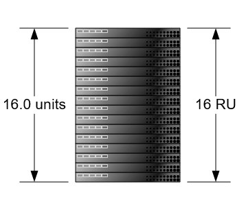
The old (and still free) Rack Unit Dimension Line
With the that version, you can:
- Set the number formatting and precision
- Specify the text to be use for the display units
- Set the physical size of a “unit”
So the old shape can be used for measuring chunks of linear space other than rack units. If this is all you need, go download that FREE SmartShape and read no further.
Over the years, customers have expressed a need to label ALL of the rack unit spaces. They want a ruler or scale, not just a dimension line that tallies the grand total. The new version has a plethora of options. It can label rack units using boxes or “checkers”, and fits nicely alongside a network rack cabinet, as you can see in these three examples:
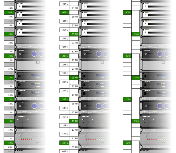
The new guy has tons of options
If you prefer more understated lines, the ÜRUDL can label cabinets like this:
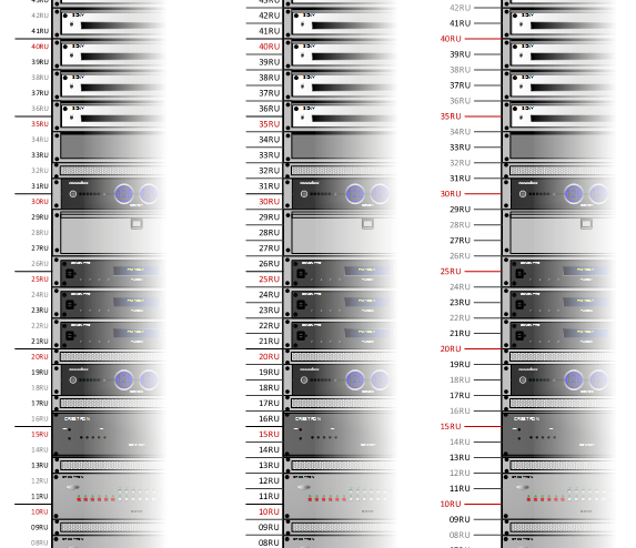
Like I said, the new guy has tons of options!
The new shape has this lengthy feature list:
- Set the number formatting and precision
- Specify the text to be use for the display units
- Specify prefix and suffix text to be placed before and after each unit label
- Specify the start and step of the text labels
- Set the physical size of a “unit”
- Set the number of units to count per tick mark
- Choose from 8 styles of “tick mark”: boxes, checkers, lines, with a variety of indentations and staggering options
- Choose to position each tick marks’ text at one of 4 different positions
- Adjust the relative font size for tick marks
- Show or hide an overall dimension line, akin to the old shape’s
- Specify fill colors for major, even and odd tick boxes
- Specify font colors for major, even and odd ticks
- Add your own, custom text to the whole thing
- Customize the set of colors used in color drop-down lists
- Show and hide non-printing visual aids that remind you what various shape-control handles are for
So yes, there has been a bit of work that has gone into expanding the capabilities. Hence the “Über” in the name!
About this Article
This article serves three functions:
- It’s the marketing piece to let you know about my new product
- It’s my testing suite – I find the best bugs while trying to explain and illustrate how something works
- It’s the Help File for how to use it.
So if you’ve purchased the product or downloaded the free trial version, then the rest of this article is essentially the user guide for the Über Rack Unit Dimension Line Visio SmartShape.
[TODO: Produce a features video on YouTube so folks can see this thing in action]
General Operation
Once you’ve opened a stencil that contains the RU Dimension shapes, you can drag one onto the page. In order to manipulate it, you’ll interact using these features:
- 1D endpoint handles
- Control handles
- Shape Data
- Right-click context menu
Handles
When you click on RU dimension shape, or “select” one, you will see a variety of handles. In the illustration below the yellow handles are called Control Handles, and the white and gray ones are the 1-D Begin and 1-D End handles. If you’ve ever used a Visio connector or manipulated a straight line, then you’ve moved “1D handles”.
Microsoft has changed the colors of handles a lot over the past few versions of Visio, so this is how things look in Visio 2013:
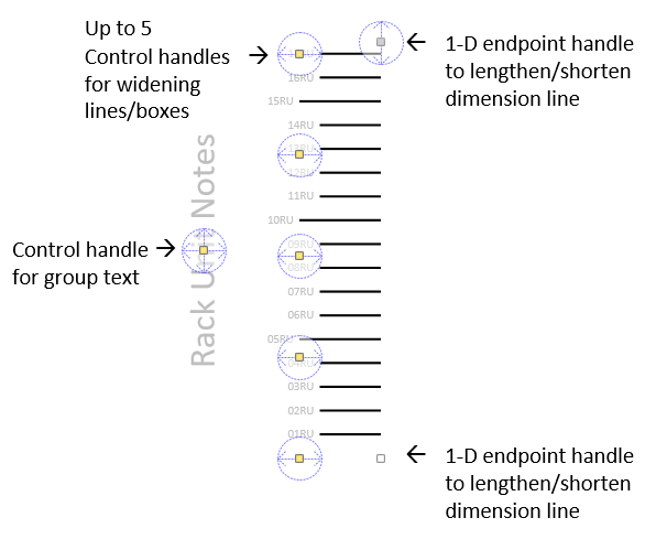
The blue circles/arrows are visual aids that I’ve built into the shape. They serve to remind you what handles are for, until you are comfortable using the shape. You can turn them on by right-clicking the shape and choosing Show Visual Aids, near the top of the menu.
Note that the Visual aids do not print, even when they are visible, so leaving them on won’t affect your output. But once you’re a pro at using the Über Rack Unit Dimension Line, you will probably not want to see them any more.
Generally, you position the shape by dragging it, then precisely place the start and end using the 1-D endpoint handles. There are up to 5 control handles for making the tick mark lines/boxes wider or narrower. Finally, if you type custom text onto the dimension line, another control handle will appear, so that you can freely move the custom text.
Shape Data
This shape has a lot of settings, and almost all of these are available via the Shape Data panel. If you don’t see the Shape Data panel, simply right-click on a shape, then choose: Data > Shape Data…
Most of the fields in the Shape Data dialog are drop-down lists, but a few are text boxes that allow you to type in numbers or text.
We’ll talk more about the Shape Data options in the Options & Settings Overview section below.
Context Menu
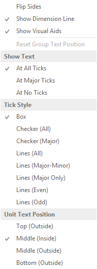
Many of the settings that you find in Shape Data pane are also available via right-clicking. Two of them are not available in Shape Data, because they are more like actions than data settings. These two are: Flip and Reset Group Text Position.
Flip allows you to “switch sides” so that dimension line is on the right-side of a network rack. Reset Group Text Position lets you restore custom group text back to its original position if you’ve moved it, and decide you liked the default position better.
One note about Shape Data vs. the context menu: using context menu items will only affect one shape at a time. If you select multiple RU dimension line shapes, then you can use Shape Data fields to change them all at the same time.
Options & Settings Overview
As you’ve noticed from the features list above, this shape has LOTS of settings, so that you can (hopefully) get your rack unit scale looking just the way you want.
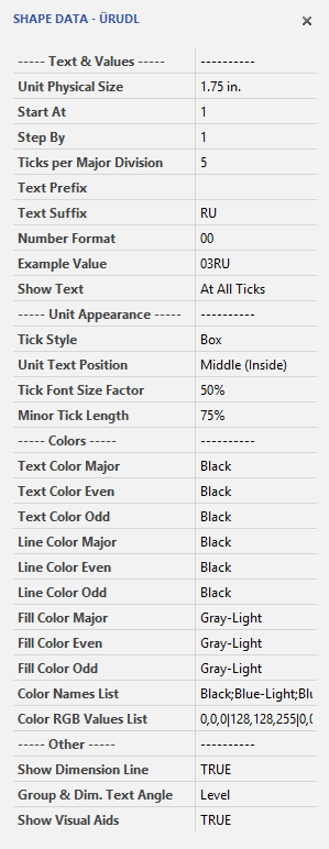
As with most of my shapes, lots of the configuration options are available via the right-click context menu. Check out this list of options in the Shape Data panel:
And when you right-click on the shape, there’s still plenty to choose from:
Here we can see the shape in the middle, flanked by it’s Shape Data settings on the left, and it’s context menu on the right:
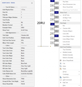
click to view larger image
Whew! That IS a lot of options!
To simplify, these are the general things that you can figure with this shape:
- The text for each unit or tick-mark, including suffixes, prefixes, and number precision
- The style of the tick-marks: boxes, lines, checkered boxes, indented lines, etc.
- The colors of tick marks and text, with options for major grouping, as well as even and odd ticks
- The position of text relative to each tick mark graphic
- A few other options
Hopefully that makes it a bit more comprehensible. I’ve also added some dividers in the Shape Data pane to make it a bit easier to find the settings you’re looking for.
Let’s visit the various settings in more detail, so you can see what affects what.
Text & Values
The top section of the Shape Data settings relate to text formatting for each tick mark.
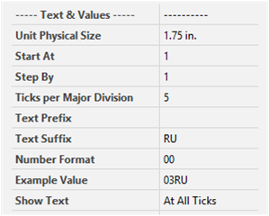
Unit Physical Size
This is the size of the unit that each tick mark represents.
You can type a number-unit pair, such as 1.75″ or 1.75 in., or 5mm, 1 cm, 1m, etc.
Start At
The number at which your ticks should start counting. Typically this will be 1 or 0, but if you are, say, measuring below-ground floor levels, you might start at a negative number.
Step By
Each tick mark can represent more than one logical unit, but this setting really only affects the text display. If you change the step, you may want to counter-change the “Unit Physical Size” setting to adjust for the step.
For example, you could configure the dimension shape to show two-rack-units per tick. This can reduce clutter and busyness in your diagrams. So first, set Unit Physical Size to 2 x 1.75″ = 3.5″. Then set Step By to 2.
Here’s the result with just those two changes:
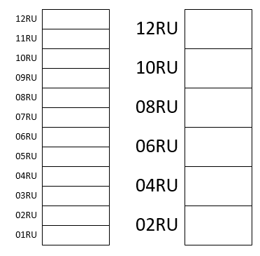
Of course, we could adjust the text size in the second shape so that it isn’t so overwhelming. Or maybe choose to display the text inside the boxes, since there is more vertical space per tick.
Ticks per Major Division
You can visually group ticks into repeating chunks by setting a “major division”. Imagine ten-centimeter major divisions along a meter-long ruler, or the longer quarter-inch lines on an Imperial-units ruler that shows sixteenths of an inch.
Once you’ve specified the number of ticks per major division, you can then specify colors for the tick text, lines and fill to further add visual distinction. For a rack, useful major divisions might be 5 or 10 units in size.
Text Prefix and Suffix
Allows you to pre-pend and append. Maybe you want to put dashes or asterisks before each value, or enclose the values in braces or brackets.
The suffix is also where you put the units-of-measure for the tick marks. As shipped, this is set to RU, because I imagine the primary use for this shape will be for labeling network equipment racks. But the shape is fully configurable, so you could set the dimension line to measure “cubits”, or horse-height “hands”, or just about any linear quantity you can imagine.
Number Format
This field has lots of drop-down choices, but you can type in your own. Generally, a “0” forces a decimal place to be written, even if it is a zero, where a “#”
So, if we had the value PI = 3.14159252358, then the following formats would yield the results:
- # would yield: 3
- 0.0 would yield: 3.1
- #.## would yield: 3.14
- 000.000 would yield: 003.140
Example Value
This is a read-only field that shows how the prefix, suffix and number format affect the look of the text.
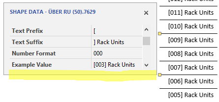
Here you can see how the prefix, suffix and number format affect both the actual shape, and the “Example Value” field:
Show Text
You can choose to show the text for All Ticks, Major Ticks, or at No Ticks. If you are heavily using the tick coloration, then no tick text might make sense, but it’s mostly there just for completeness.
In the example below, we’ve created an inch ruler. The “Ticks per Major Division” are 12. We’ve used colors to show even ticks (gray), major ticks at each foot (dark red). We’ve picked a contrasting text color for the major divisions.
The number format is “00”, so the lower numbers show a leading zero, and the text appears in a neatly-stacked column. We’ve also pre-pended an opening bracket prefix, as well as an inch/closing-bracket suffix:

Unit Appearance
Mid-way down the Shape Data panel are the settings for “Unit Appearance”, which control the box/line style, the text position, the font size, and the indented line length for each tick unit:
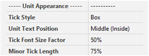
[Talk about corresponding context menu items]
Tick Style
Tick Style is arguably the most important settings as far as the appearance of the shape goes. The major choice is between boxes or lines, but there are eight settings for Tick Style in all:
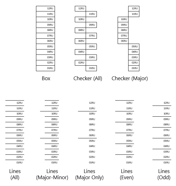
Once you’ve picked a tick style, you can decide where the text should be for each unit:
Unit Text Position
The text for each tick mark unit can be placed in one of four positions:
- Top (Outside)
- Middle (Inside)
- Middle (Outside)
- Bottom (Outside)
The naming has this structure: “Uppy-downy (Lefty-righty)”, or “Vertical (Horizontal)”. Generally, it’s probably easier to just try out the settings and pick one when it looks right. But here’s the run-down of text positions:
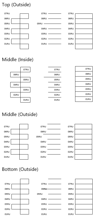
Not all of the positions make sense for all tick styles. Above, we can see that “Middle (Outside)” and “Bottom (Outside)” don’t make sense for the major-minor line style. I didn’t spend the extra effort required to make these look right, because the “what it really means” was philosophically not clear. I think the other two settings “Top (Outside)” and “Middle (Inside)” settings work much better for the line-styles.
Tick Font Size Factor
This sets the size of the text to be a percentage of the height of each tick unit.
Minor Tick Length
If you have a “major-minor line” tick style, then you can specify the minor tick length as a percentage of the major tick length.
Below, we can see how different settings for Font size Factor and Minor Tick Length affect the shape’s appearance:
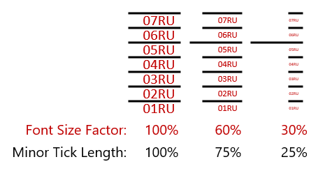
Note that Visio has a minimum font size of 1pt, so very small Unit Physical Sizes and/or small Font size Factors could result in less-than-adequate results.
Colors
The colors section looks long and intimidating, but it can be conceptually simplified:
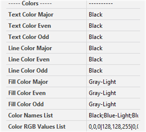
There are three groups of colors, which apply to the text, the line and the fill color of tick units. For each attribute, you can independently set colors for major ticks, even ticks and odd ticks. Having granular control over even and odd might be a bit of overkill, but you can create some nice effects. It also means lots of clicking on drop-down lists to get the shape set up just the way you want.
Keep in mind that this shape wasn’t designed with the expectation that you would fiddle with these settings every time you use the shape. The idea is that you would configure a few variations that you really like, then use those over and over.
The last two items allow you to customize the list of colors, in case the built-in set doesn’t meet your needs.
Text, Line & Fill Colors
As mentioned above, the colors for the shape are divided into three sets of three attributes. Depending on the tick style, some of the colors won’t be applicable.
Below we can see an example that has text colors set to dark-red, dark-blue, and light-blue. The major line is set to red, and the even and odd lines are set to shades of gray.
Since the tick-style is “Lines (Major-Minor)”, the fill color fields also have no effect. Compare the shape data fields and values with the shape on the right:
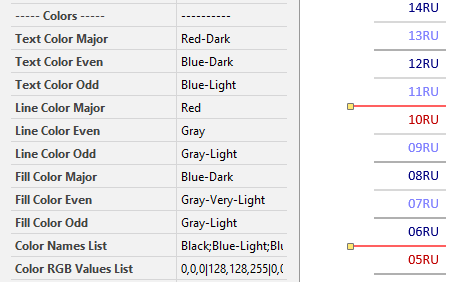
There will probably be a lot of cases where you only want the major ticks to have different coloration. For these instances, you will want to set the “even” and “odd” colors to the same values.
Color Names List and Color RGB Values List
The built-in color set is a fairly simple of 21 colors. It includes light and dark variations on basic colors, along with white, black and grays. If you decide that these colors just aren’t cool and hip enough, you can extend the color set, or completely redefine it.
The color names are a semi-colon-separated list of names, while the RGB values is a list of “double-separated” color sets. The red, green, blue values are separated by commas, and the sets themselves are separated by the vertical bar, or pipe, character. Make sure the color names are in the same position as the RGB values. Note also, RGB values are from 0 to 255, where 255 if the “brightest” value, and 0 is essentially “no color”.
For the example below, I’ve simply replaced the built-in lists with a much simpler color set:
- Color Names = Mauve;Salmon;Black;White
- RGB Values = 224,176,255|250,128,114|0,0,0|255,255,255
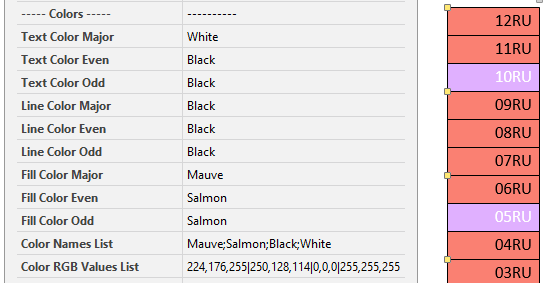
As we can see from this hard-to-look-at example, with freedom comes responsibility!
Other Settings
There are a few odd settings at the end of the Shape data dialog:
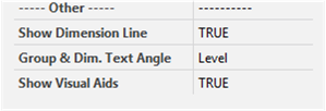
Show Dimension Line
The shape has a built-in, overall dimension line, akin to the original Rack Unit Dimension Line. It shows the overall length of the RU dimension line shape, to the nearest integral unit. So if you stretch the shape to say, 12.5 units, the dimension line will snap to 12 units, and the text will reflect that.
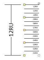
The font size of the dimension line can be set using Visio’s normal formatting buttons.
Show Visual Aids
Turns the light-blue circles and arrows on or off. The visual aids are useful for new users that want to get acquainted with the shape’s multitude of handles. Although they don’t print, they are unnecessary after you are familiar with using the shape.
Context Menu Exclusives
There are two items in the context menu that are not in the Shape Data pane. These are:
- Flip
- Reset Group Text Position
Since they are more like actions than actual data, it didn’t make sense to put them in the Shape Data pane.
Flip
Flip allows you to “switch sides” so that dimension line bits are on the right side of a network rack. If the shape is already flipped, then Flip simply flips the tick marks back to the left side of the shape.
Reset Group Text Position
Reset Group Text Position lets you restore custom group text back to its original position if you’ve moved it, and decide you liked the default position better. If the text is at the default position, then this menu item is disabled.
Additional Notes
[TODO: Sideways orientation, group text, About the N-tick-number versions]
Other Examples
Since the shape is so configurable, you don’t have to use it just for labeling network racks. I’ve coddled a few examples together here to get your creative juices flowing.
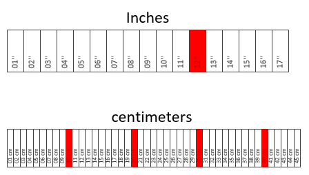
Inch and Centimeter Rulers/Scales
An obvious example is to build Imperial and Metric rulers.
The key settings for the inch ruler are:
- Unit Physical Size = 1 in.
- Ticks per Major Division = 12
- Text Suffix = ” “”
- Number Format = 00
For the metric ruler:
- Unit Physical Size = 1 cm.
- Ticks per Major Division = 10
- Text Suffix = ” cm”
- Number Format = 00
Horse Hands
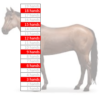
Horses are measured in units called “Hands”, which are 4-inch increments.
- Unit Physical Size = 4 in.
- Ticks per Major Division = 3
- Text Suffix = ” hands”
- Number Format = #
[TODO: other examples. High-water mark, Construction site “Bents” grids, Brick and floor tile grids, what else?
[TODO: note about drop-sizes, scaled drawings, might not see anything if dropped into a 1:1 scale drawing page]
[TODO: notes about performance of the 50 vs 400 tick versions]
Get It!
Free Version
The free trial supports up to 10 tick marks, along with all of the options that the full version has. So you can test it out on your machine, make sure it works, and verify you like it works, and that it is something you need!
Download “Über Rack Unit Dimension Line (Free Version)”
s!Aj0wJuswNyXlhGzQVCSaNQzDtWIp – Downloaded 16802 times – 103.00 BPay Version
The full version contains four master shapes in a stencil that you can place in your My Shapes folder (ie: “Favorites”). The four shapes support up to 50, 100, 200 and 400 tick marks. For performance and file size reasons, you’ll want to use the smallest version possible. I think for most network racks, the 50 RU version will work just fine. But this shape can be used for a lot of other purposes, where the 400-tick-mark version might be really useful. Let me know what you come up with!
Download “Über Rack Unit Dimension Line (Pay Version)”
Whimh – Downloaded 14836 times – 93.00 B

OK….anticipated price?
Hi Clay,
Good question. Shall we discuss it openly here in the comments? (I’ll probably delete them after “we’ve” decided.
The quandary I have is individual vs. corporate users. If someone is using this for their job, then it’s probably still useful and valuable, even for, say USD 40.00.
But for an individual that is used to buying sophisticated phone and tablet apps for $2.00, then they might find $40 ludicrous.
What do you folks think? I appreciate any feedback!
I’m no visio expert but I need to integrate the rack layout with a database in backend that keeps all the dimension data of the devices. If I get your product, can I do this? Please suggest.
Hi Debasish Roy,
The Rack Dimension line works essentially the same way that the free version mentioned near the beginning of the article. Also, there is a free version of the Über Rack Dimension Line that works exactly the same way as the full version, but it only shows up to 10 RU. So you can try that shape out, experiment with integrating it with your solution’s automation, and see if it works.
The full version will show up to 400 RU “tick marks”, if you decide it is what you need!
I had two questions, first is there a way to get the stencil to scale with the rack its snapped to instead of the page size? Also, is it possible to change the numbering to top down instead of bottom up? I know most racks are bottom up so that’s how the stencil is built but I have a top down datacenter.
Hey JF,
To number from the top down, do this:
1. Flip the shape around, e.g.: drag the shape’s handles so that the bottom is at the top, and the top as at the bottom.
2. Right-click the shape and choose “Flip Sides”.
For “scaling with the shape it’s attached to instead of the page”, hmmm. There is a Unit Physical Size property in the Shape Data, which is normally set to 1.75in. If you somehow stretch a rack shape to make it bigger or smaller, you could adjust this factor accordingly to “fake it”.
If you have any knowledge of the ShapeSheet, you could go behind the shape and create a formulaic relationship between the rack dimension line shape and the rack shape. I’m not 100% sure what you’re trying to do, and the answer would likely be too much for this comment section.