The states in the USA are all over the map when it comes to total area (aka, “size”).
We all love data visualizations on maps, but the wide range of state sizes can distort visual messages.
Thanks to inspiration from The Economist and Automotive News, I’ve created–in Visio, of course–an area-independent representation of the United States, which preserves important aspects of geography without distorting statistical messages.
A Cool USA Map Graphic Worth Copying in Visio
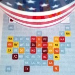
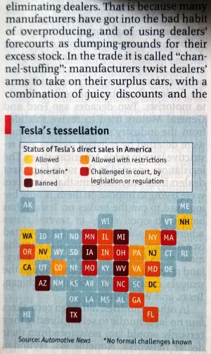
This morning I was reading the Economist over coffee and stumbled upon a really neat graphic in an article about Tesla Motors vs. the entrenched system of auto dealerships. In the article, there was a very simplified map of the USA, which gave equal visual-value to each state by representing each as a simple, tidy, rounded-corner square.
This is what caught my eye:

I blinked a few times, straightened it out a bit, and moved the coffee cup to frame the shot:
Then I noted the legend. I think it’s a really nice info-graphic. It is easy to follow–even at the minuscule size-on-paper of 5.5 cm across.
Anyone familiar with US geography will have no problem with the abstracted layout of the Scrabble tiles:
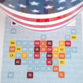
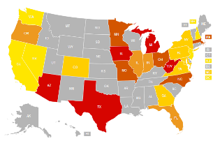
Compare it with the Economists’ source, on Automotive News. Yeah those Eastern state are tiny!
Now for the pedantic amongst you, Automotive News’ fine graphic is (depending on your monitor) much larger than the print version that the Economist presented, plus it is interactive–you can click on each state and get more info. What follows is more a praise for the Economist’s graphic than a critique of Automotive News’.
Deflated State Not So Great
We all recognize the problem with geographical maps in infographics: there is a size bias to countries, states, counties, etc.
Take these states at the opposite ends of Interstate I-90 and of SuperBowl XLIX. They both have approximately the same populations, so they likely have similar amounts of economic and demographic activity that someone might want to visualize graphically:
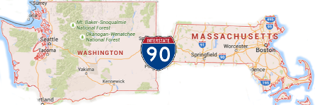
But the size difference can distort statistical visualizations. It turns out that Washington state has almost seven times the total area as Massachusetts. While I zoomed Google maps to the same scale for each state, that size difference isn’t obvious in the above illustration (What’s up with that, Google? Surprisingly, the scaling looks correct on Bing maps).
Grab a map of the USA off the web (that uses a reasonable projection) and that 7x factor seems more believable. You can see Washington WAY more easily than Massachusetts. That’s not really fair! It’s like Massachusetts has been (magically) deflated below pressure levels stipulated in the regulations and the two states aren’t playing on an equal field!
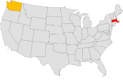
Even crappy performance by Washington can be more noticeable than winning performance in MA. Say we’re making a heat map of Super Bowl victories. Massachusetts (New England/Boston) has 4, which is a LOT more victories than Washington (Seattle), which has only 1. But on a geographic map, it’s easy to overlook:
Equal Areas Under the Draw
By creating a stylized, abstracted map of the USA, we can remove the area bias from the visualization, while still preserving the useful geographic layout of the country. (Funny thought: is this what the U.S. would look like if all the states had taken the lead from Colorado’s and Wyoming’s borders?!) After creating the map, I imported some data which could easily be auto-linked (by state name or state abbreviation) to data rows.
Yes, the state shapes in the free download are all pre-populated with basic state-related identification data that will help you to auto-link your data to each state. Shape Data fields include: Name, ISO abbreviation, ANSI/USPS abbreviation, ANSI ID, and the Index for the order of admission to the Union.
Examples:
- Washington, US-WA, WA, 53, 42
- Oregon, US-OR, OR, 41, 33
- California, US-CA, CA, 6, 31
Example Data Visualizations
With those identifying fields pre-built into each shape, all I needed to do was scour the web for state-related data and make sure it was lined up with a column that had the state’s name or abbreviation. Then I could import it into Visio and use the Data tab’s “Automatically Link” button to add the appropriate data to each state.
Then I could create a Color-by-value Data graphic to view that data in the diagram. Here are some examples that I came up with:
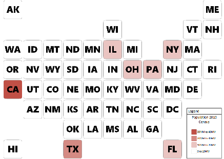
This one is for population, according to the 2010 Census. We can see that a linear scale for color gradation doesn’t work so well, because, well, most of the states are relatively empty (<10,000,000 residents. It also shows us that the Rust Belt is full of people, and that the big, sunny states are also crawling with carbon-based units.
Rather than dig up another data source, I created one by concocting a ShapeSheet formula that counts the number of characters in the shape’s Name property. The associated Data Graphic gets more color-intense as the character count in the state’s name rises. You can see that the US has a nice distribution of short, medium and long state names. Isn’t that interesting?:

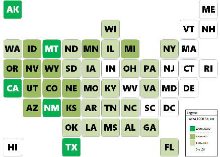
Finally, we can examine the original problem that related to the land-area of states . This color-by-value heat map shows the areas in thousand-square-kilometers for each state. As many of us know, the states in the East are small for the most part, and the states out West are big. For this map, I made a two-tier gradation. Anything over 500 “thousand-square-kilometers” gets the lime-green. These are the Monster States. In the legend, I added a horizontal line to highlight this tier. The rest of the states have a nice gradation of white-to-avocado green, with even steps from 0, 100, 200, 300.
It is easy to see that the states in the East tend to be small. Of course that was easier to see on the original geographic map!
I’d be interested to hear which kind of data visualizations you come up with.
You can download it for free here:
Download “USA States Map with Equal-sized States”
s!Aj0wJuswNyXlhgMhxhcfmgaT3t7G – Downloaded 3789 times – 103.00 Band leave comments about what you do with it down at the bottom of the page!
Oh, and if this type of map has an established name, please also let me know that in the comments as well!
Speaking of Scrabble, be sure to check out the FANCY version of the template. It uses Visio 2013’s new shadow, reflection and 3D rotation features!

click to view larger image

Great Article! Great Find! I haven’t seen geo data organized this way before, and it does make so much sense. I’ll wait and see if it shows up on Fox or CNN with Red and Blue squares. Perhaps in Visio!
Red and Blue squares, haha!