 Are you looking to create data-visualizations that relate to the people in your audience?
Are you sick of pie charts and other boring graphics?
Then you will be interested in the “Visio Village Diagram Template”, which helps you to illustrate data with a human touch.
“Village Diagrams”
I’ve been reading an interesting, creative and informative web-site called Information is Beautiful. As the title suggests, the site focuses on data visualization of issues, ideas and knowledge. Creator, David McCandless, has an entertaining, edgy style of writing which will keep you laughing, and informed.
One of the articles introduced me to the idea of the “If Something Was a Village of 100 People” style of graphic. I don’t think McCandless invented this type of graphic, but he made a nice presentation of how a representative village of Tweeters might look.
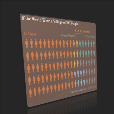
If you haven’t clicked on the previous link, or guessed from this article’s thumbnail, a Village Diagram looks something like this:
In my book, “one hundred” is just a fancy way of saying “percent”. And when I say “percent”, you might start thinking about pie charts, or some other type of graphic that shows percentages or relative amounts.
But when the numbers involve people, I think these visualizations help to drive home the point. Maybe our brains evolved to handle a few hundred acquaintances or less –the size of a village–and this visual taps into that ancient wiring. At any rate, I like the village diagrams. Especially if the number of groups is small, maybe a maximum of six or seven.
Visio as a Data Visualization Tool
A lot of the cool, data-visualization web sites use high-end Adobe products to create their snazzy graphics. Along with the high price of these products comes a high learning curve as well. The good thing about this is that people who use these products tend to be adept graphic illustrators as well. And it shows in their high-quality art work.
But there are a whole lot of Visio users out there, who I bet would like to make data visualizations like this. And I suspect that very few of them have Adobe Illustrator on their corporate PCs.
It turns out that Visio’s SmartShape and automation capabilities can make the creation of some of these visualizations easier and richer. As I built this Visio village diagram template, I kept adding features to the core symbol shape that make it a snap to whip out one of these graphics.
Smart People Symbol
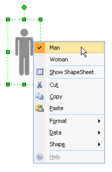
The first order of business in creating the Village Diagram Template was to make a smart symbol. As you’ve already seen, it can depict a man or a woman silhouette. Changing the symbol is easy, and can be accomplished in one of two ways.
1. You can change the symbol by right-clicking it:
2. You can use the drop-down list in the Shape Data window:
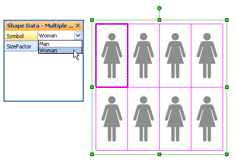
Note that the Shape Data method works for a multiple-selection of shapes, which can save you a bunch of time when you are dealing with 100 shapes!
Trial #1: World Population by Region
Once I had my SmartShape working, I created a duplicate and changed its sex. With a man and a woman in hand, I created a copy of them by Ctrl+Drag-ging a copy to the right. Then I just hit F4 eight more times to repeat the duplication until I had 20 rows of people. Similarly, I copied the entire row four more times vertically until I had all 100 villagers.
You don’t need to do the setup work, because the template already has 100 people ready and waiting for you!
Here’s an village-of-100-people example which shows world’s population, according to how many people are living in various geographic regions. Believe it or not, this graphic was created in Visio using the Village Diagram Template:
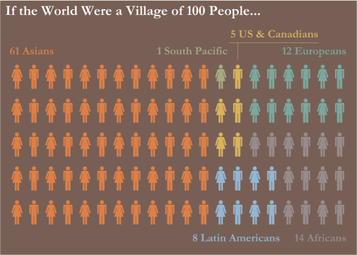
In this example I copied McCandless’ use of male/female icons, because I liked the visual balance it offered. It also makes it easier to count columns for both readers and creators.
But you run the danger of unintended interpretation:
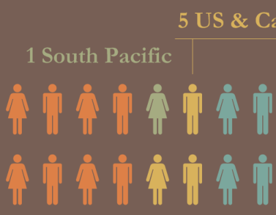
Since the South Pacific Islanders only get 1 unit in the village, they are unintentionally depicted with just the woman symbol. If you’ve seen the football players they send to the US mainland, then you know that there are some serious Men that come from that region.
Trial #2: World Population, Women vs. Men
I mentioned earlier that you can select a bunch of people symbols, and change their gender using the Shape Data drop-down list.
This made a depiction of the boy-ness and girl-ness of the world’s population a snap to create:
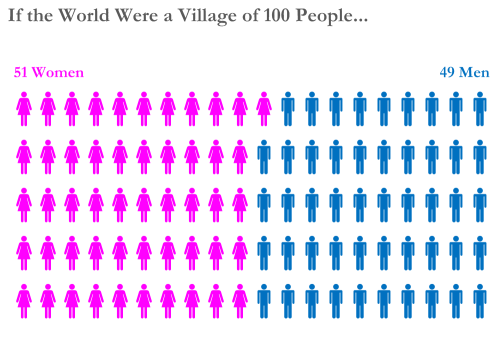
A quick net selection around half of the shapes, plus a Shift + Click on one shape more or one shape less, and I could quickly set the symbol using the Shape Data field.
Trial # 3: Obesity in America
The problem with building SmartShapes is that you always think of new features to cram into them. As I was building the test diagrams, I thought it would be neat to vary size in addition to color. So I added another feature to the shapes, and another dimension to the diagram:
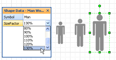
With a size variable to play with, the easy choice of data was obesity in the United States. This diagram took about three minutes to complete:
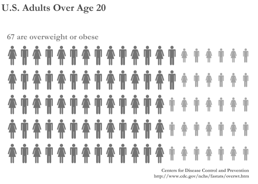 If you’re wondering, the big people are 110% of normal size, and the little people are 80% to add to the contrast. I also cheated by making the small guys a shade lighter, so color does actually play a role in this visualization. But I still think the “absence” of color makes the chart clearer to read.
Label Shape
Colored people-icons or people of different sizes tell a big part of the story, but not all of it. You need a small bit of explanatory text, and that’s where the label shapes come in.
You’ve seen the labels already. They abut the top or bottom of the diagram. There are a few options that make the label easier to use, all just a right-click away.
You can turn the outline on or off, and you can quickly flip it horizontally and vertically in the right-click context menu:
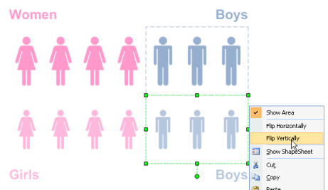
Secret Feature: you can turn all areas on or off by right-clicking the page.
To keep things simple (or maybe not), you change the label’s color by changing its fill color, not its text color:
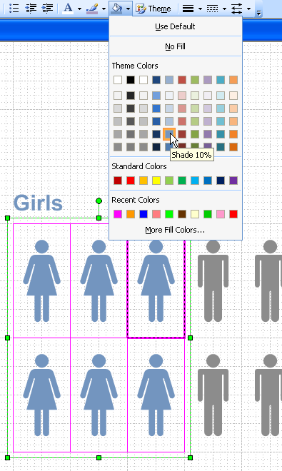
The reason for this is that you can select a bunch of people shapes, along with their corresponding label, and change their colors simultaneously, with one command. This beats having to change the fill color of the shapes, then having to change the text color of the labels!
Legend Shapes
The label shapes are nice, but if you have regions of people that aren’t contiguous, or aren’t accessible from the top or bottom edges, the labels won’t quite do the job.
For that reason, I’ve included a legend shape that can be color-coded, and located apart from the main village.
Take, for example, this fascinating chart:
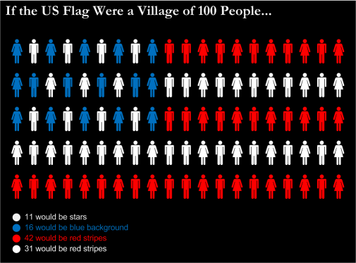
The legend shapes down below clearly work better than labels. Even having two identical colors doesn’t foil the legend below!
If you don’t like dots, don’t worry. The legend shapes support four different symbols, which you can access by right-clicking the context menu, or by using a drop-down in the Shape Data window:
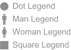
The font size is directly related to the height of the shape, so you don’t have to fiddle with specifying a particular value. Just stretch the shape until the text looks good, then copy however many legend items you need:
 Similar to the label, the color of the text is linked to the fill color. Normally, you would have to specify a fill color, then choose the identical color for the text. This is a waste of time, and SmartShapes can easily solve this problem. So just select a legend shape, and choose a fill color!
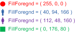
So for just about every shape in the diagram, you only need to worry about fill color, not text or line color. Simple!
Future Versions
If you really like this type of thing, then let us know in the comments below. If the download is really hot, I might consider adding some features.
I can imagine writing code to help count the number of shapes underneath the area of a label shape, or linking the color of people shapes to that of a legend or label. We could even select some data in an Excel chart and automatically generate the sets of people and choose some colors.
All good fun, but I think the template is easy enough to use “by hand”, and the shapes offer some additional smarts that help you to work faster.
Once again, thanks to David McCandless for a bit of inspiration, and best of luck his new book, The Visual Miscellaneum:
Download “Village of 100 People Diagram Template”
s!Aj0wJuswNyXlhxeyaUGEBX7qyqkf – Downloaded 5840 times – 103.00 B

Very nice Chris – I love it!
John
Thanks John,
I was dying to work the bumper sticker “Somewhere in Texas a village is missing an idiot” into the article, but it just didn’t quite fit, and since we’ve got a new president, well the jokes have changed.
Note to self: do something funny about expensive national health care plans…
I’m a new user, Chris. I’ve downloaded this cool template, but when I use it the diagram comes up with your logo on top and I can’t get rid of it … it’s locked somehow. Can you help?
Bryan
Hehe Branding I guess!
Most of my downloads are shapes that people use in other drawings, so I didn’t think carefully about templates.
I figured people would just configure the drawing, then copy the bits into a PowerPoint presentation or a Word document.
You could copy the people stuff into a new drawing, and save that as “My Village of 100 Template.vst” (note the .VST extension)
The steps to get rid of my hidden background pages and locked logos are pretty arduous, so I’ll hold off on that for now.
Ah … I see it now. Thanks.
Cool.
After seeing this presentation,
http://www.slideshare.net/edfk/why-statistics-need-context
I was just wondering how to make this kind of diagram..
and you just made this post recently!
No idea why, but pass-through logon to WordPress ismply won’t let me in, even though I can log on and visit my blog stats dashboard etc.
Is there any other way I can get this download?
Pretty please?
how can i download this ?
Can you offer some updated steps for those of us using Visio 2010? I’m a new user and I can’t even seem to find the SmartShape option you’re showing here. Thanks!
Hi Chris!
Is there a Mac version for this software? Thanks!