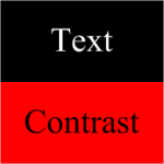
 For a long time, I’ve been wondering: what makes a color dark and what makes a color light?
I’ve been wondering this because I wanted to know, quantitatively, why I sometimes need white text and other times need black text in order to make a shape readable.
If you are designing shapes that use lots of color, or that are intended to be used with Visio 2007’s color-by-value data graphics feature, you might be wondering the same thing.
And if you are looking to construct a ShapeSheet formula that automatically selects a text color based on the background color of a shape, then you might really be wondering about this!
Well recently, I stumbled upon a solution!
The Answer Isn’t Black and White
If you’ve messed around with color components, or even clicked on More Colors… in one of Visio’s numerous formatting drop-down lists, you’re likely to have run into the idea that colors can be constructed, using the RGB color model.
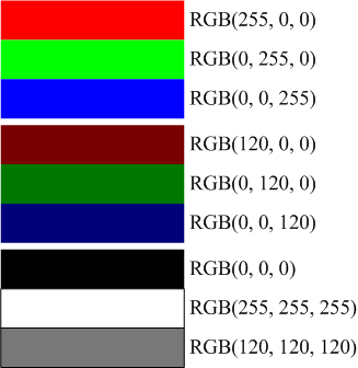
Using RGB, a color is built from three values of red, green and blue. Each value can range from 0 to 255, where 255 is the full value of the color.
This is pretty simple, especially if you have something to look at. Below, you can see that the colors get darker as we decrease the values. If all the r, g, b values are identical, we get a shade of gray ranging from white to black.
With this little bit of RGB knowledge in hand, it seems that we could simply pick a cut-off value to determine Darkness or Lightness. But unfortunately, it’s not that simple.
Below, I’ve illustrated three shapes, each having the full brightness of red, green or blue. We can see that the red and blue are arguably Not Bright:
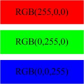
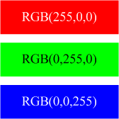
While the green box is certainly Bright, and much-deserving of black text, you could easily make a case for putting white text on the blue shape, and even get away with white text on the red:
Pythagoras Was Here
Thankfully there is a God(s), the Internet, Google, and other people with brains…and difficulties. For example, the W3C has studied this issue, with accessibility for those with visual disabilities in mind.
I recently browsed upon a wonderfully informative article by Nir Dobovizki, over at NBD-Tech. The article: Calculating the Perceived Brightness of a Color, explains in depth the issues behind Brightness and Darkness, the various methods used to calculate it, and other interesting background information.
In the end, Nir proposes his own variant of a brightness formula that I found worked well, and was easily converted to a ShapeSheet formula:
Brightness = sqrt( .241 R^2 + .691 G^2 + .068 B^2 )
where R, G and B are the red, green and blue components of a color, respectively.
The formula looks very similar to Pythagoras’ formula for a hypotenuse, but in three dimensions. The coefficients are there because our perception of red, green and blue is not uniform, as I demonstrated before.
The brightness formula returns a result between 0 and 255. If the value is below a certain level, then the color is deemed Dark. Otherwise There Be Light. Nir suggests a value of 130 as a cut-off.
Thanks for all the help, Nir!
Pick Text Color Automatically
After reading Nir’s article, I fired up Visio, drew a rectangle, whipped open the ShapeSheet and added a User-defined cell with this formula:
User.txtColor = IF( SQRT(
                         0.241 * RED(FillForegnd)^2 +
                         0.691 * GREEN(FillForegnd)^2 +
                         0.068 * BLUE(FillForegnd)^2
                         ) < 130, RGB(255,255,255), RGB(0,0,0) )
Note: I added the line-breaks to the formula for readability. You won’t get away with this in the ShapeSheet!
Anyway, this ShapeSheet formula analyzes the value of the FillForegnd cell, which is generally holds the color of a shape. If a shape were to have a fill pattern, then we’d have to deal with FillBkgnd as well. But the pattern will also add to your contrast problems, so let’s not worry about that right now.
Using Visio’s ShapeSheet functions: RED( ), GREEN( ) and BLUE( ), the FillForegnd color is broken into RGB components, analyzed for brightness, and compared to a cut-off value.
The brightness value is wrapped in an IF comparison. You can see the ” < 130″ bit near the end is where the brightness value is compared to a cut-off value.
Based on the IF-result, one of two text colors is returned. If the expression is False, then the color is Dark, and the first color is returned: RGB(255,255,255), which is white.
If the expression evaluates to True, then the color is Light, and the second color is returned: RGB(0,0,0), which is black.
Once our ShapeSheet formula was accurately distinguishing light from dark, we could then link User.txtColor to the cell that determines a shape’s text color: Char.Size, like this:
Char.Size = User.txtColor
and voila, our text-color automatically reacts to our fill-color!

Change Your Perceptio
The cut-off value of 130 is open to interpretation. And since it lives in only one place in our formula, it is easy to change.
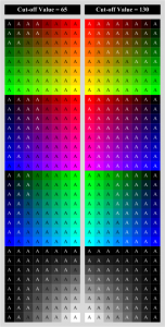
In order to see how the cut-off value affected things, I created two versions of the shape: one with a cut-off of 130, the other with a cut-off of 65.
I then created a bunch of matrices with many background color to see how the 65 shapes compared to the 130 shapes. You can see the results below. I flipped one column of shapes so that you can more directly compare them to the other.
Click to see larger image
I actually like the results for 65 better than for 130. As you would guess, 130 leaves a lot more white text than does 65, since it sees the world as a darker place, so to speak.
I think the final test would be to see how the test patterns print on various printers.
Excercises for the Reader
To make sure you’re all still awake, and not sleeping in class, I thought I’d propose some further tasks that might help reinforce the concepts we’ve discussed today.
Expose the cut-off value in the user-interface
Since the perception of light and dark is somewhat subjective, you might want to expose the cut-off value so that it can be easily changed. See if you can link that “130” value to a Shape Data (Custom Property) field. Then you can easily change it using the Shape Data window (accessible via the View menu)
Create a test matrix using code
If you think I drew all those squares by hand, and colored each one individually, then as my dear old Dad would say; “You’re NUTS!” I wrote some VBA code to handle this automatically. All I have to do is select one of my smart-text-color Visio shapes, and run the code. The shape gets copied a bazillion times, and gets fitted with a new color, automatically!
Hint: Visio has ShapeSheet functions for decomposing colors into RED( ), GREEN( ) and BLUE( ) values. But you can also compose a color using the RGB( ) function.
A sample bit of VBA code might look like this:
Dim shp as Visio.Shape
Dim f as String
Dim r as Integer, g as Integer, b as Integer

'// Get values for shp, r, g, b from somewhere:
'// ...
'// ...

'// Build the ShapeSheet formula as a template:
f = "RGB( [red], [green], [blue] )"

'// Replace the place-holders in the formula template:

f = Replace( "[red]", r )
f = Replace( "[green]", g )
f = Replace( "[blue]", b )

'// Set the Fill-color formula in the shape:
shp.Cells("FillForegnd").Formula = f
Leave comments (!)
Let us know how you do with the exercises. There are inviting, empty comments fields waiting at the end of this article for your input!
- What modifications did you come up with?
- Any cool new variants on the theme, or nifty smart-text-color Visio SmartShapes that you’d like to share?
- If you get stuck, let us know that too.
- Which bits would you like to see explained further?
- What would you like to have available for download?
If you’d like to share your inventions with the Visio community, feel free to send them to us at:

Maybe we can feature them in up-coming articles!

Another way to go that I have used is to have the text color cell to set text color off of fill color.
Conceptually….text color RGB = mod((RGB(fill color) – 130),255). This automatically sets text to a light color if fill is dark and vice versa. This does tend to keep the text color in the family of fill color
(light reddish text for dark reddish fill)
The”Pythagorean” algorithm could be used to set the text color in a more independent form than fill color
(shades of white-gray-black regardless of fill color family). May need to play with coefficients since
gray text on pink is pretty hard to read.
Good stuff, Ted!
I used to play around with trying to make tints and shades of the fill color, using the HSL( ), HUE( ), SAT( ), LUM( ) functions, but never got it to work right.
Visio 2007 added some new functions: SHADE and TINT which make things easier, but you still run into the problem of white and black – a shade of white is just white.
But your Modulus technique is cool. I never thought about how Modulus can be used to “wrap around” ’til I read one of David Parker’s articles: Using Fill Patterns with DataGraphic Color By Value Nice solution to the what text-color to choose for extreme colors like black and white!
Very interesting Ted
Where can i get hold of the visio program
Try it:
Microsoft Visio 2010 (click “Try Visio 2010”)
Or buy it:
Buy Microsoft Visio 2010