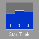
Today, Visio Guy will show you how to create a three-bar SmartShape and link it to data using Visio 2007 Professional’s brilliant “Link Data to Shapes” feature.
We’ll cover the intricacies of creating a shape that visually reacts to data, and show you how to link instances of this shape to actual rows of data in an Excel spreadsheet!
This is the first in a three-part series on data graphics and data linking, so read-on, and stay tuned!
The Trilogy Meter: A Simple Graphic Visualization Assignment
A few days ago, I was perusing the always-fascinating Flowing Data, and ran across a Friday fun post by Nathan, who runs the site.The article showed the Trilogy Meter a data visualization by Dan Meth, which compared how much Dan had enjoyed each part of various movie trilogies.
For instance, if you look at the first image in this article, you’ll see that Dan enjoyed the second Star Trek film more than the first and third.
I found this application of data visualization amusing, and figured that it would be a good framework to show-off and explain how to use the data-linking features in Visio 2007 Professional.
Also, a lot of the content on Flowing Data is too-cool Flash animation, interactive Mac/Adobe, flying logo on mouse-over stuff. It’s really neat, but you can’t get your hands on it very well. You can’t carry it around in your own document, annotate it, modify it, or paste it into a PowerPoint presentation very well. There are a lot of Visio users out there, and many of them are surely interested in data visualization. I thought this might be a good opportunity to create a bridge between a great web-site and a great Windows diagramming application!
In today’s article, we’ll create a Visio shape that has three bars, as you see in the image above. The bars will be linked to data stored in the shape, and that data will be linked to external data stored in an Excel spreadsheet.
Getting Started
Before we go too far, lets cover a few prerequisites and give an overview of what we’re about to do.
Visio 2007 Professional Only
First off, the data-linking features that we are going to use are only available in Visio 2007 Professional. If you have Standard, you won’t find some of the features and menu items to which we’ll be referring. You will still be able to build the bar-chart shape, and make it respond to Shape Data fields, so part of this article will be applicable to just about every Visio user.
Trilogy-meter Data
Next, let’s describe what we want to do. I’ve created an Excel file that has data extracted (estimated) from Dan Meth’s personal trilogy meter. You could easily create and modify your own version of this data, as it is fairly simple:
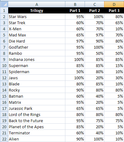
To save you a bit of time, you can get the data here:
Download: trilogy-meter-data.zip (5 KB)
Visio Data Visualization Shape
Our goal is to link this data to a Visio bar-chart shape that looks like this:

Note that the shape dispplays the title of the movie trilogy, and shows three data-related bars for each part of the trilogy. The bars show a percent, 100% being a full bar, 0% being no bar.
It doesn’t look like much, but if you’re new to Visio shape development, it isn’t immediately obvious how to create such a beast. Hopefully this article will reveal a few of the tricks, and show you that you can create shapes like this in just a few minutes, once you’re armed with the right information.
Building the Bar-chart Shape
The first step in building the bar-chart shape is to create a single bar. Just draw a rectangle using the Rectangle Tool on the Drawing toolbar.
Draw a Bar and Move the Pin to the Bottom
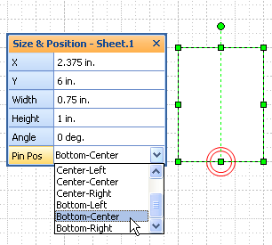
Because our bars grow from bottom to top, we’ll want to move the shape’s Pin to the bottom, so that the shape doesn’t stretch about its vertical center.
To move the Pin to the bottom, open the Size & Position Window under the View menu, then set the Pin Pos to Bottom-Center, as shown here:
Duplicate and Group the Bar
Once you’ve got your bar drawn, copy it two times so that you have three of them. Add the numbers 1, 2 and 3 to each bar, then format and style them as you like:
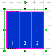
Now group the bars together by selecting them all and typing Shift+ Ctrl+G or going to the menu Shape > Grouping > Group.
Create Shape Data Fields
The shape will require four data fields: Trilogy, Part 1, Part 2, Part 3. We will define them using the Define Shape Data dialog. To get to this dialog, select your bar chart then go to: Data > Shape Data.
You’ll be alerted to the fact that “No shape data exists. Do you want to define shape data now?” Just click Yes and proceed.
Add the Trilogy shape data field, and give it a type of String.
For Part 1, Part 2 and Part 3, give them data types of Number, and enter <,%>0u for the Format, as shown below:
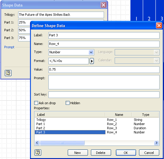
That mysterious formatting string will cause our “Part” values to be displayed as percentages with no decimal places. I haven’t quit figured out what the angle-brackets are for, but for now it works just fine.
Insert the Trilogy Data Field as Text
Now’s a good time to link that Trilogy data field to text on the shape.
Select your group and Insert > Field. You’ll see a dialog that looks like this:
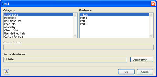
Choose Shape Data from the Category column, and Trilogy from the Field name column. After you hit OK, your group will have text linked to the Trilogy field. But you might not see any text yet, because your field might still be empty.
So open up the Shape Data Window, which you can toggle on and off via the View menu. Once you’ve got it open, add a value to it, like, oh, say, “The Future of the Apes Strikes Back”.
This text should show up on your shape, but right-smack in the middle, on top of the bars. We’ll move it out of the way in the next step.
Move and Resize the Text Block
Ok, we’ve got the Trilogy text sitting on top of our bars, so let’s move it out of the way using the Text Block Tool. You’ll find it under the “A” icon on the Standard toolbar. You have to drop-down the little arrow to the right of the “A” to get to the Text Block Tool, as shown:

When you select your bar chart shape using the Text Block Tool, it looks like you will be resizing/repositioning the shape as normal. The green handles look the same. But you will actually be moving a “sub” box that belongs to your shape and controls the position of your text.
So give it a whirl. It’s a bit confusing the first time you use it, because it is not uniquely distinguishable from other shape operations, but it’s not hard. Just have your fingers read at Ctrl+Z in case something goes wrong. You should be able to do something like this:
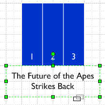
When you’e happy with the text position, Ctrl+1 is a quick way to get back to the standard arrow tool.
Link the Part Shape Data to each Bar
To link each individual bar to the Part 1, 2, 3 shape data fields, we’ll need to go into the ShapeSheet. In the ShapeSheet, we’ll be creating Excel-like formula references. It looks a bit scary, but if you’ve used Excel before, it is not entirely foreign.
Step 1 in this process is to get the ShapeSheet row names for each shape data field. Select your bar chart group, then click on Window > Show ShapeSheet. In the resulting spreadsheet window, find the Shape Data section:

The cells and rows in this section correspond directly to the Shape Data fields that we defined before. Note the row names for each “Part” field: Part 1 has a row name of Prop.Row_2, Part 2 has a row name of Prop.Row_3, and so on. On your shape, the row names might be a bit different, so make sure you note the correct values.
Now that we know the row names of the group’s shape data fields, we’ll need to delve into the ShapeSheets of each individual bar.
Notice that you can sub-select each individual bar. Just select the bar-group, wait a split-second, then click on one of the bars. You’ll see slightly different handles with Xs in them, and a light-gray outline of the group. It looks like this:
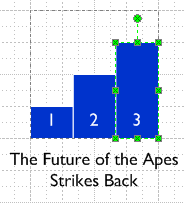
When a bar sub-shape is selected, you can go to Window > Show ShapeSheet, as you’ve done before. When you do that, you’ll see that each bar has a Height formula that looks something like this: Height = Sheet.8!Height*1
In the ShapeSheet, it might look like this:

Sheet.8 is ShapeSheet code for the group. The ! tells us that we are cross-referencing a cell in another sheet (ie: another shape) In this case, the sub-shape’s Height is then a factor of the parent shape’s Height. In the above example, they are equal because of the *1 multiplier.
We want to change the height of each sub-shape so that it refers to the corresponding “Part” shape data field in the parent shape. Ie: Prop.Row_2, Prop.Row_3 or Prop.Row_4.
So for the first bar, change the Height formula to be: GUARD( Sheet.8!Height * Sheet.8!Prop.Row_2 )

This will cause your sub-shape to be a fraction of the group’s height, and that fraction will be the percentage stored in the Shape Data field!
Note that your group might have a different ID from 8. So you might need to type Sheet.152 or Sheet.43 istead of Sheet.8.
Also, in the screenshot above, I’ve forgotten to put the GUARD at the beginning. GUARD just adds extra protection to the formula in the cell: it tells Visio that a shape designer intended for a custom formula to be there, and Visio should refrain from trying to write default values to that cell.
Repeat the change to each sub-shape’s Height formula, but remember to change the row name that you use in each formula!
Once you’ve made the changes, you should be able to test the shape by entering different values in the Shape Data window. The bars should react to the percentage values that you input.
Make a Master Shape
Now that your bar chart shape is functioning properly, it is time to make a re-usable master out of it.
Make sure your “local” stencil is showing. You do this via: File > Shapes > Show Document Stencil. Every Visio document contains Document Stencil. This is where masters that have been dragged into the document get stored as “local copies”.
Once you’ve got your document stencil showing, you can drag your bar chart shape onto the stencil. The quickest way to rename it is to select it, press F2, then type a new name, such as: Trilogy Bars.

You have now completed the process of creating the bar-graph Visio SmartShape! We are now ready to use it in data-linking situations.
Link Data to Shapes
Everything we’ve discussed up until now can be done with virtually all versions of Visio. But now we move into the data linking features that are only available to Visio 2007 Professional users.
Fire-up the Data Source
First, we need to get that Excel data into Visio so that Visio can access it and link it to shapes. Under the Data menu, you’ll find a wonderful little item called Link Data to Shapes.
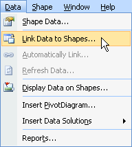
Click on that, then browse to the Trilogy-meter data Excel file that we’ve already discussed. Follow the steps in the data import wizard as best as you can. I usually just click Finish right away and hope that Visio figures things out correctly. For simple data sources like ours, Visio usually does pretty well.
If you’ve correctly imported the data, you should see something like this at the bottom of your Visio drawing window:
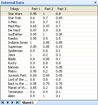
Prepare for Drag-and-drop Data Linking
To link these data records to our Trilogy Bars shape. We need to do several things at once, so to speak:
- Right-click in the data window and choose Select All to mark every record
- Make sure that the Trilogy Bars master is selected in the Document Stencil window
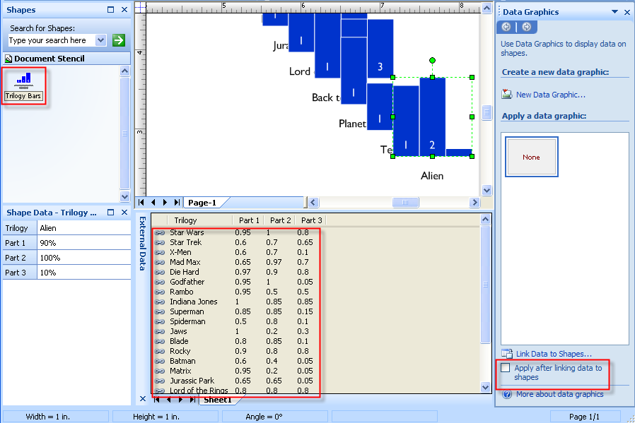
- Make sure that the Apply after linking data to shapes item in the Data Graphics pane is unchecked
Item number three might not make sense if you don’t have the Data Graphics pane visible. If you don’t see it at the right, go to Data > Display Data on Shapes. Then you can uncheck the item.
It sounds complicated, but makes much more sense if you just look at the red areas in this illustration:
click to view larger image
Drop ‘Em!
Now you can simply drag selected mass of rows from the External Data window onto the drawing page.
You’ll get a cascading set of Trilogy Bars shapes, each one linked to an individual row of external data. After you’ve done the drop, not how each row in the External Data window now has a chain-link, which indicates that one or more shapes on the page is linked to it.
In fact, if you double-click on a data row, Visio will select the linked shape in the drawing window, so you can see who has what data. If more than one shape is linked to the data, then subsequent double-clicks will highlight the next linked shape.
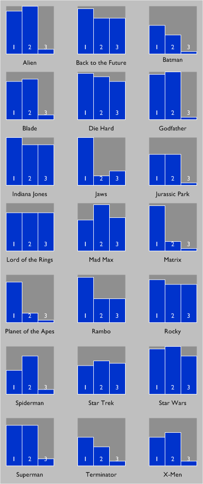
With a little re-arrangement, you’ll end up with something very similar to the trilogy meter that we first encountered on Flowing Data:
Updating Visio Master Shapes
One last tidbit before you go for lunch.
You might also notice that I’ve added a dark background to each Trilogy Bars shape, so that it is easier to see where 100% is. This was easy to do after-the-fact because we were clever enough to create a master shape, and not just duplicate the shape 20 times.
With a master, each instance on the page gets its definition from a single place. So I was able to add the dark background to the master, and each instance updated automatically. The process went something like this:
- Double-click on the Trilogy Bars master, or right-click and choose Edit Master > Edit Master Shape
The master will open up for editing in a new window - We need to get inside the group to add the background, so select the group, then choose: Edit > Open Group
- In this new group window, draw a rectangle that matches the size of the group. Format at to your liking.
- Send the rectangle to back using Ctrl+Shift+B or Shape > Order > Send to Back
- Close the group window
- Close the master window and say Yes to: “Update Trilogy bars and all of its instances”
All of the Trilogy Bars shapes should now be updated with a nice background!
See You Soon!
Well I know that was a long one, but I hope you found it informative! Check back soon as we complete our trilogy of trilogy-meter data-linking articles!
Part II: Trilogy-meter Data Graphics Part II

Do you know any way to do something as “Link Data to Shapes” with Visio 2003?
Thanks a lot and congrats for your site
Hi Inerxia,
Visio has had some data-linking features for a long time. The features in Visio 2007 are more integrated–especially that cool External Data window.
On your Visio, have a look under: Tools > Add-ons > Visio Extras. There are some “Data Wizard” features. They are a bit less-intuitive, but some of the possibilities are even more powerful than what was discussed in this article.
I’m not sure if the Database Wizard stuff changes much between Visio 2003 Standard and Pro editions.
Hi Visio Guy,
Could you please advise me to add Y-axis and X-axis in the Trilogy-meter Data Graphics example since Data Bar’s Maximum value is not working when Part1,Part2 and Part3 have huge amount ?
Appreciate for any comments.
Thank in advance.
Best Regards,
Thet Tin Oo