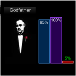
 Today we’re going to talk about adorning Visio shapes with data graphics, and the extreme flexibility that Visio data graphics offer.
This is slightly different than what we discussed previously in Trilogy-meter Data Graphics Part I. In that article, we linked data to shapes that were built specifically to be info-graphics.
This time around, we’ll apply info-graphics to shapes that already exist…and we’ll stay out of the ShapeSheet while we are doing it!
Data Graphics vs. Linked Shapes
In Trilogy-meter Data Graphics Part I, we built a three-bar graph shape that responded visually to changes in its Shape Data fields. These shapes were then linked to Excel-based movie-ratings data to show one man’s enjoyment of each film in a trilogy. So for the Star Trek series, we could quickly determine that Wrath of Khan (the second film) was slightly better than the 1st and 3rd offerings:
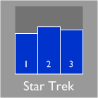
This shape used smarts programmed into the ShapeSheet that reacted to Shape Data fields which stored a percentage “liking” for each film, which were extracted form an Excel file using Visio 2007 Professional’s Link Data to Shapes feature. Phew!
Today we’ll create a Data Graphic to augment an existing shape. The end result is similar, but the process is quite different. We’ll end up with something that looks like this:
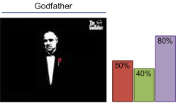
Here, the main shape is simply an imported image that we quickly swiped from the web. The bars and the text label are Data Graphic Items that belong to a single Data Graphic. This data graphic can be quickly applied to the shape, and quickly removed. You could also define several different data graphics and choose which one to apply to the shape.
The important point here is that data graphics offer a lot of flexibility by decoupling the shape from the data display. With data graphics, the info-graphic is separate from the shape. The shape simply needs to have some data to display, but it doesn’t need to be built to show the data, as in the previous article.
Create an Image-Shape With Data Fields
Before we get too far into this, I’d like to make sure that one thing is clear: the data-linking features shown in today’s article are only available in Visio 2007 Professional. If you have Standard, you won’t find some of the features and menu items to which we’ll be referring.
Import an Image
So let’s get to work finally. We’ll need a nice image to start with, so go off to Google or MSN or your favorite search engine and find an image of a movie to import into Visio. As we’ve hinted, the data set that we are working with has to do with movie ratings for popular trilogies. So you might choose an image related to Star Wars, Jaws, Planet of the Apes or The Godfather.
We’ve got a pre-built set of trilogy ratings data all ready-and-waiting in an Excel file that you can download. We’ll be using it later on, but you might as well get it now:
Download: trilogy-meter-data.zip (5 KB)
Once you’ve got an image, you can import it using Insert > Picture > From File. This is generally better than copying and pasting, as discussed in: Effects of Imported Images on Visio File Size.
You should now have a nice image sitting on a Visio page, just waiting for further instructions.
Avoid a Dead End: Group the Image!
When I originally started this little project, I added data fields to the image-shape, built the data graphic then, POOF! I found out that data graphics can’t be applied to images for some reason. It seems like a bug to me, or else I’ve done something really silly and just haven’t figured it out.
At any rate, the simple work-around is to group the image with nothing but itself. This takes about 1/2 second. Just select your image-shape, then type Ctrl+ G or choose the menu item: Shape > Grouping > Group. Your shape will now be grouped, but you’ll hardly notice any difference!
Add Shape Data Fields
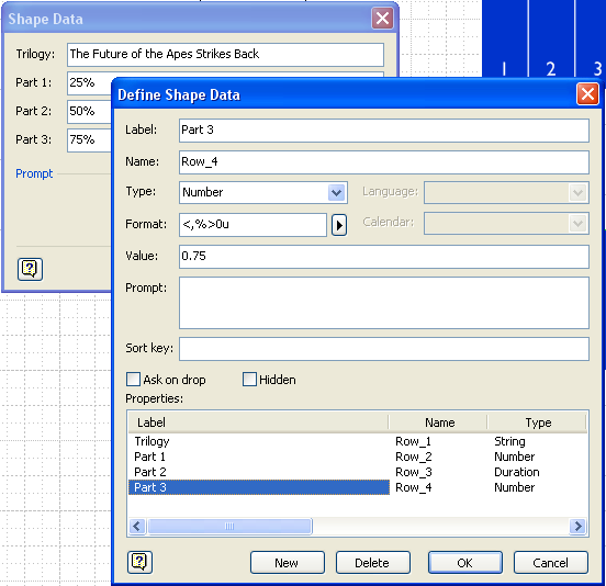
The only other change we really need to make to the image is to add some Shape Data fields to it. These are: Trilogy, Part 1, Part 2, Part 3.
Trilogy just holds the name of the series, and the “Parts” hold a percentage from 0% to 100% (or a number from 0 to 1) that will be displayed in the data graphic.
We discussed how to add these fields in Trilogy-meter Data Graphics Part I, but we’ll quickly repeat it here.
- Select your image-shape-group thingamabob
- Go to: Data > Shape Data
- You’ll see an alert: “No shape data exists. Do you want to define shape data now?”
- Click Yes
- Add the Trilogy shape data field, and give it a type of String
- For Part 1, Part 2 and Part 3, give them data types of Number
You can enter <,%>0u for the Format, but for this article it isn’t necessary - Enter some data in the the Value fields while you are defining them, or after you click OK, add some data.
You should see something like this. The Trilogy field should have some sort of title text, and the parts should have values from 0 to 1 or 0% to 100%:
Build the Data Graphic
Now that our shape has data fields associated with it, we can define and apply a data graphic to it.
Define Data Graphic Bars
We’ll need to show the Data Graphics Pane in order to get started with our data graphic definition. So go to Data > Display Data on shapes… to show the pane.
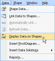
You should see a window like this on the right-side of your Visio workspace:
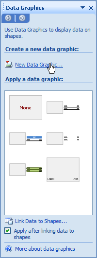
Now, click on the underlined New Data Graphic… near the top of the Data Graphic Pane. This will get us into the New Data Graphic window, where we can start adding Data Graphic Items to our data graphic.
In the New Data Graphic window, click on the New Item drop down, and select Data Bar…
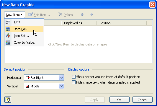
This will dive us deeper down into the data graphic definition dialog depths, presenting us with long awaited and eagerly-anticipated New Data Bar dialog (*gasp*):
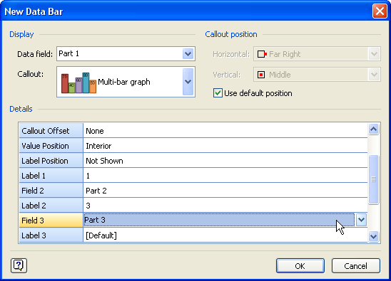
Since this data graphic item will be linked to multiple fields, there are lots of options to fill-out. Most importantly, we want the Callout drop-down to be set to Multi-bar graph, as show above.
You can peruse the options at your leisure, but the goal is to select which fields to display in the data graphic. When we start the data graphic definition process, Visio scans the existing shapes for the Shape Data fields, among other information. These fields are then offered in the drop-down lists for the various data graphic items. That is why it was important to define the Shape Data fields for the image-shape first. It just makes things easier.
For our trilogy data graphic, you’ll want to set these important fields before closing this window:
- Data field: Part 1 (this is confusingly at the very top of the window)
- Minimum Value: 0
- Maximum Value: 1
- Value Format: Percentage, 0 decimal places (which results in a format string of <,%>0u, which I haven’t totally figured out yet…)
- Field 2: Part 2
- Field 3: Part 3
The Label fields didn’t show up when I entered text in them, so you can ignore them for now. If I figure out what is wrong, I’ll amend this article, or if you figure it out, please leave a comment below!
You can now OK, OK, OK your way out of the dialog soup. You should now have a new data graphic icon in your Data Graphic Pane.
Apply the Data Graphic to Your Shape
Armed with your freshly-defined data graphic, simply select your image-shape, then click on your new data graphic icon:
![]()
You should see something that looks like this:
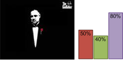
Not bad, eh? But it still needs some text to show off the title.
Editing the Data Graphic: Add a Text Calout
We want to show the movie-trilogy title, which is stored in the Trilogy Shape Data field. We can do this by adding another element, or data graphic item to our data graphic. So let’s begin by editing our data graphic. You can do this by right-clicking the icon, then choosing Edit Data Graphic…
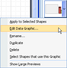
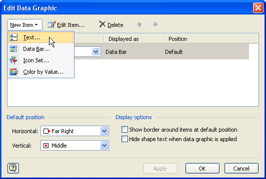
We’ll add a new Text item, like so:
There are lots of Callout types to choose from. In this example, I chose Heading 2. You can experiment with different callout types at any time:
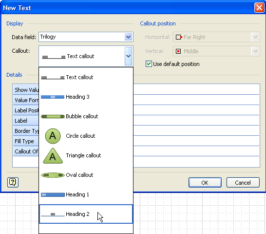
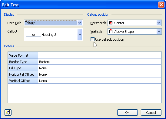
Once we’ve added our new text calout, we’ll need to link it to shape data and specify a few settings:
- Data field: Trilogy
- Callout: Heading 2
- Label: “” (ie: nothing, blank, nada, zippo)
- Use default position: Uncheck this
- Horizontal: Center
- Vertical: Above Shape
It should look a bit more like this:
Once you’ve OK’d your way to freedom, your improved Don Corleone will now proudly display the Trilogy’s title:

Our data graphic is complete! You can apply this data graphic to any shape that has the corresponding fields.
If you apply it to a shape that doesn’t have the fields, Visio will ask you if you want to redefine which field should be used with the data graphic. If you choose “Yes” and proceed with the re-definition, Visio will create a new copy of your data graphic, along with the new definitions. It won’t stomp on your hard-work.
Import Data to Use With Your Shape and Data Graphics
You can manually enter data in your image-shape via the Shape Data window (available under the View menu)
But you can also link data directly to your shape by dragging and dropping records from a list. If you downloaded the Excel file we talked about earlier in this article, you can open it for use in your drawing by going to: Data > Link Data to Shapes…
Follow the wizard’s instructions by browsing for the Excel file and answering the various questions. Our Trilogy-data Excel file is pretty simple, so you can probably get away with just clicking Finish early on in the wizard and saving brain power.
Once you’ve imported the data, you can simply drag records on to shapes. It should all look something like this:
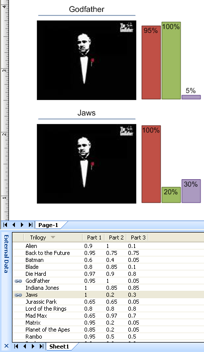
Now I know it doesn’t make any sense to show Jaws data on a picture of Marlon Brando, but the point here is to tease you with capabilities that we might discuss in future articles. So stay tuned for Part III!
Improving the Look
If you don’t like the colors of the data graphics, well you’re (still) in luck! By default, Visio’s data graphic elements use the new Themes feature, which means that their color and styling is decoupled from the actual data graphic. So not only can you apply various data graphics to a shape, but you can also change the color and styling with just a few clicks!
On the Formatting toolbar, there is a button that says Theme, which will make the Themes Pane appear and disapear on the right of your screen. There you can horse around Theme Colors and Theme Effects to change the look of your drawing. If things start to get ugly or out of hand, you can always go back to the original state by clicking the big, fat None button.
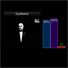
In the example shown above, I imported a custom theme from the article: Battle Zone Theme Template.
I also changed the text callout style for the data graphic from Heading 3 from Heading 2. This was as easy as
- Right-clicking our just-built data graphic
- Choosing Edit Data Graphic…
- Selecting the Trilogy item in the resulting list
- Clicking Edit Item…
- Re-specifying which Callout type to use in the drop-down list
And that’s that for Part II of our Trilogy on Visio 2007 Professional’s Data Graphics features. I hope you’ve enjoyed and learned. And again, if you’ve missed part one, be sure to check out:
Part I: Trilogy-meter Data Graphics Part I!

Leave a Reply