 An interesting idea for visualizing Moore’s Law came to me today while “watching the internet”. Come in, have a look, and grab the free download, if you want!
I was just watching a documentary on YouTube entitled Shenzhen: The Silicon Valley of Hardware.
During the intro phrase, the obligatory reference to Moore’s Law was made in a discussion about how spending tons of money to developer super computers was oftentimes wasteful, particularly if the development time took more than two years. In that time, the Moores-law-Intel tortoise would catch up with the supercomputer hare: you could rely on relatively “cheap” transistor-counts roughly doubling every two years, and this would make profits of supercomputer sales hard to acheive. The public could wait a bit longer for the mainstream to catch up and save a lot of money in doing so.
When the narrator talked about this Moore’s Law doubling, he painted a scene where the the doubling of transistors on a chip was akin to halving the font-size on a piece of paper and squeezing twice as much text onto the page. An apt metaphor, since the increase in information-processing technology performance made the handling of more information possible.
I thought that was an interesting idea, and it inspired me to make this relatively “fluff” article-plus-free-download for you today!
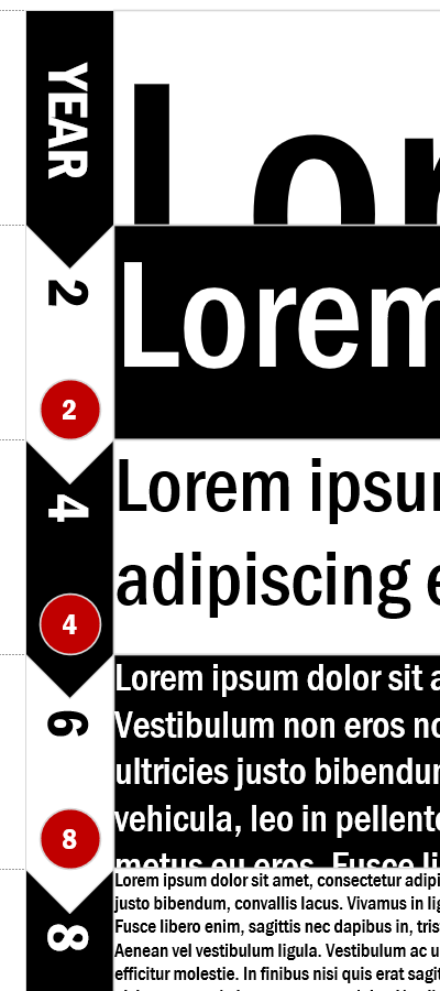
Essentially, I start out with a huge block of 128pt text, then I halve the size of the text “every two years”. Of course, more text shows up in each subsequent rectangle:
To generate text in a sane manner, I used the Lorem Ipsum generator at lipsum.com to automatically procure lots of latin-esque nonsense text, but it seemed to crap out at 10,000 words (only! boohoo!), so I had to copy and paste additional blocks at the lower font sizes. I know, CHEATING!
Oh, by the way: be sure to check out the Lorem Ipsum Placeholder Text Shape that was made long ago, but still (probably) works just fine in newer versions of Visio!
The visualization covers 14 years, or seven doublings, where the final font size is 1pt text. At this point, Visio says; “I ain’t gonna render anything smaller than 1pt text!”, so it’s a good place to stop. That and it was the bottom of the page:
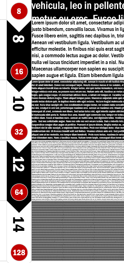
The text is, in fact, teensy weensy at this point, so you’re more (moore?) than getting the point!
Along the way, I stumbled upon an interesting effect, whereby you could make it look like you’d filled larger characters with words of a much smaller font size. Check this out–in Visio! no less:
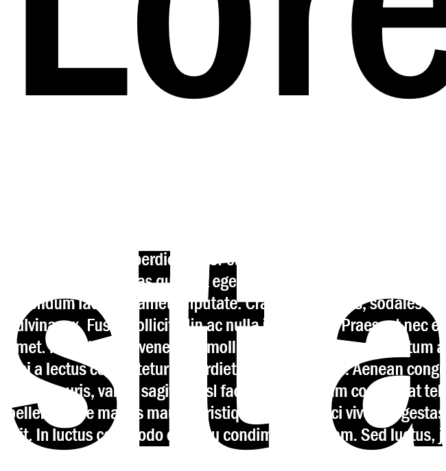
Ok, it’s a cheap trick. The small text has no fill color or pattern – so whatever is beneath it shows, except for what the tiny text obscures. If the tiny text is the same color as the background, the illusion is complete.
Here, I’ve reversed the color, rotated the tiny text block a bit, and shown the overflowing text, to some extent. It reveals the magic a bit more clearly:
 To complete this visual, you just have to make the white masking rectangle on the left a bit taller to cover up the rest of the overflowing text.
Pretty neat!
Download the file! You can pry apart my work for free by downloading the .zip file with the link below. I’ve also added a few notes that might help you to up your Visio skills a bit. Or you can just use bits and pieces in your own documents, diagrams, and presentations!
Download “Moore's Law Visualization”
s!Aj0wJuswNyXlh3ceTsOhyCoozwGd – Downloaded 2293 times –
too much time on your hands….better to take a sentence and repeat it….64 pt, 32 pt,16 pt, 8 pt, 4 pt, 2 pt kind of thing
Actually not too much time. Squeezing out a fluff piece like this was done at great personal stress. But at some point you have to neglect work a bit and have some fun!
in terms of visual appeal ,, I see Brilliant lateral thinking, thank you.