 Yay! It’s the weekend! Everyone’s checking facebook to see where Friday beer garden will be. And even if you’re not a facebook user, news of their IPO has surely crossed your browser. Ah, another bunch of filthy rich, young nerds in the valley! Enjoy those expensive Lego Technic and Mindstorms kits you can now afford, guys. You’ve earned them!
“But Visio Guy”, you may ask, “what does this have to do with Visio?”
Good question, Billy! You see, since the ancient times of Roman Caesars…and the Fonz…humans have needed to visualize binary data. Many, many situations in life are binary. On/Off. Up/Down. Good/Bad. Black/White. Online/Offline. Working/Broken. iPad/Flash. Cool/Not cool. Let-live/Lion-food. You get the picture. And people do this every so simply (and coolly) by showing thumbs-up or thumbs-down.
Today, the most recognizable icon of this expression has to be facebook’s “like” icon.
I thought the thumb would be a fun and useful Data Graphic for users of Visio 2007 Professional, Visio 2010 Professional, or Visio 2010 Premium. Users of those products have the Data Graphics feature available to them, which allows quick application of visual effects to the information stored in data-connected shapes and diagrams.
So I built a Visio SmartShape that has three states: Thumbs Up, Thumbs Down and Off or invisible. I modified this into a Data Graphics Icon Set so that you can add to your own Data Graphics and use it to highlight important data in your Visio diagrams. You don’t have to use all three states, but sometimes it reduces clutter and makes visuals more noticeable if the mundane cases don’t show anything.
If you copy any of the shapes in the download file to your drawing, you will bring the Like Icon Set and a pre-made Data Graphic that uses it into your drawing. Navigate to the Data Graphics drop-down and hover your mouse over one of the Data Graphics to see it’s name. You should see a little pop-up tooltip that displays “Like Data Graphic” or “Like Laptop Mfg Data Graphic”. (“Like” being the name of the thumb icon!) You can also right-click on any of the items and choose whether to: Edit, Rename, Duplicate, Delete, numberswiki.com
or Select Shapes that use this Graphic.
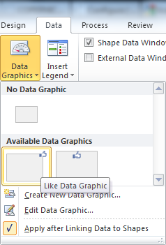
I won’t go into to all the details on how to incorporate this Icon Set in your Data Graphics, but I’ll say a few words, and point out a few settings. There are plenty of online sources of information and a I go over creating Data Graphics in my Book as well.
When I make new Icon Sets, I usually test drive them with a simple bit of information: the width of a shape. This saves me the trouble of creating new Shape Data fields, and allows me to quickly test on a simple rectangle. Here I’ve defined a Data Graphic that shows thumbs-down when a shape is less the 0.75 inches, and thumbs-up when it is greater than 1.25 inches. The “mundane” zone between these criteria show no thumb at all:
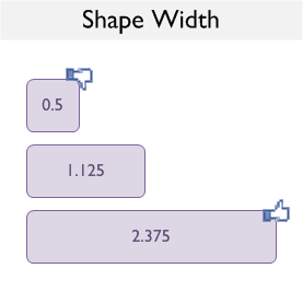
The Data Graphic Item settings for this Data Graphic look like this:
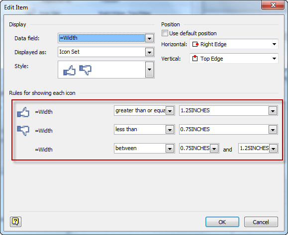
These are numeric ranges, since Width is a numeric values. I actually typed in 1.25 in, 0.75 in, etc. Visio changed it to INCHES afterwards, oddly. No worries, you don’t have to type INCHES or MILLIMETERS or PICOTS, you can use common unit abbreviations.
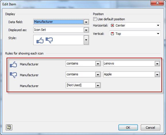
Moving on to another moderately more useful application, let’s look at network diagrams. Our facebook Like Icon Set would probably be more suitable to bits of info like machine status, age of hardware, time since last software update or service overhaul, etc. But I instead couldn’t resist being opinionated and tied it to the Manufacturer field, like this:
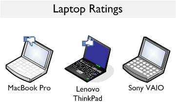
The only criteria that trigger thumbs are “contains Apple” or “contains Lenovo”. The rest show no icon. In this Data Graphic, textual comparisons are being made. The “Contains” and “Does not contain” criteria are useful for these types of tests. Have a look at the settings to see how it’s done:
Well that’s a brief overview of the ‘Like’ Data Graphic Icon Set. I hope you find it amusing, contemporary and, above all, useful!
Download “Facebook Like Data Graphic Icon Set”
s!Aj0wJuswNyXlhUnSyGSXJDOvPOMa – Downloaded 2716 times – 103.00 B
Why is the icon so chunky?
I wanted to recreate the icon-look. There are many styles and fashions these days. When I searched for “facebook like icon”, the results contained many smoothed-out, full-fidelity illustrations which I thought looked rather cheesy. So I went with Icon this season.
Visio *does* seem to do some dithering and smoothing anyway, which I don’t really like in this case.