If you’ve Visio for any amount of time, you might have noticed that the selection handles that you use to manipulate shapes take on various forms.
With the coming of Visio 2010, the universe of shape handles gets more complex, because the Microsoft team has changed the look. This will cause confusion as veterans talk to newbies, and people refer to older blog posts for in-depth info about using Microsoft Visio.
So I thought I’d post a few articles that talk about shape handles, and discuss the differences between past and future versions of Visio. If you are an advanced Visio user, or you are developing solutions for Visio, you’ll want to understand the subtle differences between 1D shape handles.
Visio has two classes of shapes, affectionately known as 2D and 1D.
2D shapes are box-like. They have eight handles around the edges that allow you to change the width and height independently or at the same time.
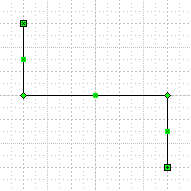
1D shapes behave more like…lines. If you’ve used the connector tool and dropped an unglued connector on to the page, you might have seen something like this:

And if you’ve drawn a simple line, you might have seen this:

If you look real close, you can see that one end of a 1D shape has an “x” and the other end has a “+”. This is important for identifying the official Begin of the shape and the official End of the shape.
In versions of Visio before Visio 2010, the handles were the green x and + that you’ve seen. The x represents the Begin of any 1D shape, and the + represents the end. Let’s look at it up close:

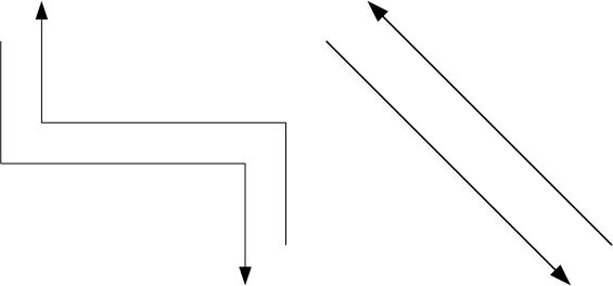
Knowing which end is the Begin and which is the End helps you to enforce consistency across documents. One problem that arises comes from the fact that you can apply an arrowhead to either end of a line.
Here, all the shapes are drawn from (Begin) in the upper-left corner to (End) in the lower-right. But the arrowheads lead you to believe that they were drawn in reverse order: two from top-left to bottom-right, the others from bottom-right to top-left.

If you are just trying to illustrate a concept, then Begin vs. End might not be that important. But what often happens is that the employees of an organization create many, many flowcharts. After they’ve drawn all these process, they then decide that it would like to program a tool to read information from all of their Visio documents.
Code that looks for arrowheads to determine the direction of a shape is awkward and sometimes unreliable. It is better to properly structure documents using the official Begin and End of 1D shapes.
It’s not that every user needs to understand the intricacies of 1D endpoint icons, but a corporate solution developer or shape designer could ensure that only the End can take an arrowhead, for example.
Begin and End take on meaning in diagrams. For organizational charts, the Begin of a connector would be connected to the superior, the End to the subordinate. In a flowchart, Begin should be connected to the previous step, End to the next stop.
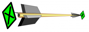
In case you’re wondering about the x and the +, let’s take a small historical diversion for a moment. I believe the original design involved a theory that related the icons to real-life arrows. The “X” was what you saw when you looked directly at the tail feathers, and the “+” was what you saw when you looked at the arrowhead. I suppose that makes some sense…until you rotate the arrow 45 degrees! Seems to me the End should have been a dot to represent a point.
click to view larger image
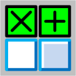
In Visio 2010, the x and + are gone. We now have two boring blue boxes, where the Begin is “hollow” and white. The 1D End looks almost the same, but has a gray filling. I think it’s about as visually clear as the x and + were, so I can’t really complain.
This web site and others have hundreds of screen shots involving 1D handles that will suddenly become irrelevant to users of Visio 2010. As new articles are written using pictures of Visio 2010, users of older versions of Visio will also be confused when finding information on the web. I hope articles like these will help clear up some of the mud!


Why did they change the handles? The new handles look so similar it’ll be hard to distinguish. Change for the sake of change is not always a good thing.
The best reason I can come up with is to make Visio look more and more like regular Office.
But after looking at PowerPoint 2010, well, all of their handles are more silver-shiny, BUT their rotation handle is a green lollipop…like Visio’s used to be. So PowerPoint has more Visio-like shape handles than Visio 2010?!
But we could start a Top Ten list for fun.
Top Ten Reasons Microsoft Changed Visio’s Green Handles
1. To look more like Office
2. To give me something to write about
3. To give you something to bitch about
…
4. Powder blue consumes less power than dark green to display
5. glossy powder blue requires the use of an addition processor core to paint vs dark green….sell more cores
6. Powder blue uses 3.216 less bytes than dark green to store in memory/disk.
Keep them coming
I always had the feeling Vojo was at least 5.82x smarter than the rest of us (combined). Now I’m sure. And I believe those numbers! 🙂 🙂
7. The management consultants say we must all learn to embrace change.
8. Green handles (made from copper compounds) cost too much. Powder blue can be made from healthy blueberries.
9. In “The Great Gatsby”, the color green represented “hope”. We’ll have none of that!
10. Visio 2022 will feature handles in Soylent Green (Chris, please don’t name any child of yours ‘Sol’).
Think about the numbers for Visio Colo(u)rs:
Blue is 4
Green is 3
They made 1 change
As a former mathematician I will show you the formula, the result may be known to some of you:
43-1 = 42