![]() The end of an age of terror is nigh!
The end of an age of terror is nigh!
Visio 2010 creates a live preview of your master shapes so you don’t have to fiddle and futz around. You don’t have to waste time and effort making low-quality, 32 x 32 icons with 16 colors that still look lousy no matter how much time you spend on them.
It is about time!
Stumbling Upon New Features
My journey through icon land began slowly, with a little poking around.
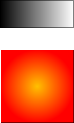
I had drawn and formatted two innocuous-looking rectangles, like this:

Useless as they are, I nevertheless dragged them to the Document Stencil. Hey it’s the Visio 2010 beta, maybe something new might happen!
The result of this intrepid dragging-and-dropping was two spankin’ new Visio 2010 masters that you see here:
![]()
Master.2 and Master.3 aren’t much to look at, until you try to do the same thing in Visio 2007 or earlier versions:
![]()
See how crappy those icons are?
The Way it Used to Suck Be
For many, many moons, Visio content developers have had to suffer in agony, representing their carefully crafted shapes with 32 x32 icons, in a stinking 16 colors, in a silly format not compatible with other icon formats, using an archaic icon editor written by the former president of Visio Corporation sometime in 1991. (For the curious, more Visio history here)
To summarize, the master icon editor has long been the butt of many bitter jokes.
Visio Icons Enter the 21st Century
If you take another look at that Visio 2010 Document Stencil, it appears that Visio is (finally) doing something modern with its stencil icons. In fact, I was reminded of a conversation I had with a developer at the last Visio Summit. I believe he said something about the new icons being rendered as vectors with the best possible quality. I can’t remember the exact words, but the quality is certainly apparent!
Intrigued, I pressed on. Visio icons have always had a little-known feature that allows you to make 64 x 64 pixel icons. So I fired up Visio 2007 and made two big icons, using the shapes on the left:
![]() Again, the icons are less than spectacular, despite having four times as many dots as normal icons.
Again, the icons are less than spectacular, despite having four times as many dots as normal icons.
In Visio 2010, things are looking pretty good. The icons on the left look like the shapes on the right:
![]()
These icons are still set to “Large”–64 x 64, but the quality is clearly way above that of icons.
This is really encouraging for many reasons:
- Your work will be more realistically presented to users
- You will not have to waste time cleaning up master icons with sub-standard editing tools
- Your Visio solutions will look more professional
What Happens to Legacy Icons?
I have a collection of old Visio icons that were carefully and meticulously created. These were lovingly undertaken because the auto icon-generation was crap. The collection lives in a stencil, and the masters have been cleared of any shape-contents to save disk space. This is just a stencil full of empty masters that serve as carriers for Visio icon art.
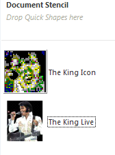
Here’s the icon collection, for kicks:
![]()
Fun, eh?
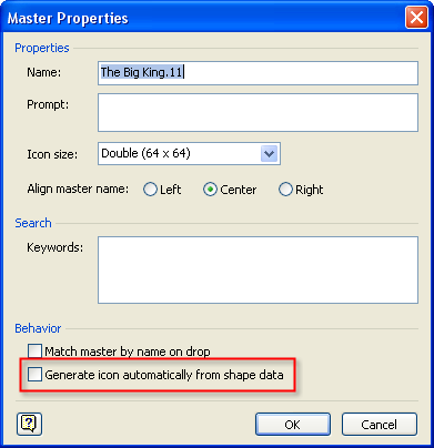
Since these icons are empty, I needed to uncheck “Generate icon automatically from shape data” in the Master Properties dialog. Otherwise Visio would have tried to update my icon with the nothing that was inside the master, and destroyed my work.
Here’s the Visio 2007 Master Properties dialog:

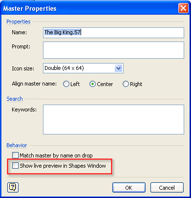
In Visio 2010, that checkbox has been replaced with one that says: “Show live preview in shapes window”.
Here’s the Visio 2010 Master Properties dialog.

If you check the new box, then Visio will create a nice, high-res rendition of your master shape. If you uncheck it, then you can use a custom icon.
Furthermore, when you check and uncheck this box, Visio doesn’t forget custom icon bits you have created. You can toggle between custom icon and live preview. You get the best of both worlds!
There are definitely shapes that are uninteresting in their default states, or too abstract to identify by how they look. Custom representation is still a need, and the old custom icon feature will save you in these cases.
What would really be nice is to have a way for saving a custom “Live Preview”.
And the Icon Editor?
So you can still use icons in Visio 2010. And to create them bit by agonizing bit, you need a tool. I could only laugh and shake my head when I discovered the raggedy-old icon editor with the shiny new Ribbon interface. Have a laugh for yourself:
![]()
The function-set is still the same, as far as I can tell. Sigh!
I’ll be using Live Preview as much as possible…


Your series makes the pain of {not being among the chosen ones for testing} bearable.
Apparently they must have been listening at the last Visio conference when this was brought up…
Hey! ShapeWare, Elvis, and James Bond make an appearance!
And Fahrni makes an appearance too! I wonder how easy it will be to integrate the Grumpometer in the Ribbon…
Yes, the grumpometer would be a very nice addition! Hey, I think I hear a shape coming. 🙂
We need a picture of Grumpy himself to put on the icon.
But wait, there’s more…
Tease…?
http://blogs.msdn.com/visio/archive/2009/10/09/live-rendering-shapes-in-visio-2010.aspx
Thanks Mark! Nice reference to the EGA Color Palette, btw!
You mentioned in your article that you had “collection of old Visio icons that were carefully and meticulously created”.
How do I obtain a copy of these?
Hi Daniel,
You really want the icons pictured above? They seem a bit random, can’t imagine they’d be particularly useful to anyone…
I was hoping for the “Tank Truck” icon from the list near the top of this post, if that is possible!
Thanks!
Hi Daniel,
Sent you a link per e-mail…