 A common question from budding Visio SmartShape developers is: “How do I get my text to resize with the shape?” Well, there are a few typical responses to that question, but this article focuses on a very simple method that you can use for text that does not change. So if you’re building shapes with company logos, digital readouts, or something similar, then read on!
Visio doesn’t resize text because in many cases it makes sense to allow more or less text to fit into a shape. This is particularly true for flowchart shapes, which is Visio’s bread-and-butter. But sometimes you want text to size with the shape. One simple solution is to simply paste text as a metafile. This essentially creates a graphical element out of the text — it will stretch and shrink like other shapes, but you lose the ability to edit it further.
What follows is a walk-through of how to convert text to metafiles, plus some scintillating background information on the topic.
Traditional ShapeSheet Methods for Smart-resizing Text
I guess I’ve been at this waaay too long if I talk about “traditional ShapeSheet methods”, but let’s proceed. The stock response to getting text to resize with a shape is to enter a formula that looks like this in the Char.Size cell:
Char.Size = 12pt*Height/2in
Where 12pt is the original font size, and 2in is the original height of the shape. If the user resizes the shape, the font size will change as the height of the shape changes. This works for simple cases, and depending on your audience, may be totally sufficient. However, there are a number of things that can go wrong:
- If your drawing is scaled, then a more complicated version of formula has to be crafted, using a ratio of the page values: ThePage!PageScale and ThePage!DrawingScale.
- If you have mixed formatting in your text (ie: bold, italics, colors, sizes, fonts), then you’ll have more than one row in the Character section, which may mean entering the formula multiple times.
- Visio won’t render text at less than 1pt. So if the formula evaluates to 0.25pt, you’ll get 1pt text, which is too big.
- If you use a custom font, for say, a nifty logo, your target users might not have that font on their PCs. Instead, they’ll see a not-so-hot fall-back font, which can sometimes make for a serious let-down!
You can learn more about controlling font-sizes by reading the article: Text Resizing With ShapeSheet Formulas.
Some Text Never Changes
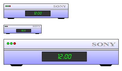
A lot of Visio fanatics out there are building network equipment, or A/V equipment shapes. These shapes are chock-full of logos, button labels, and digital readouts. Take, for example, the fictitious SONY-gizmo Visio shape pictured below (apologies to Sony Corp. for this over-simplification of their finely designed products!) It’s a real beauty, ain’t it? And you may have quite a few shapes in your collection that are similar.

Anyway, there are two things of Text Interest to us here: the “12:00” and the “SONY” never need to change. But the size of these two text blocks should always be proportional to the shape!
The first step in creating a shape like this is just to draw the circles, rectangles and text blocks using the basic Visio drawing tools. Once we’ve done that, we can group them together (using: Ctrl+G). But we’ll see upon resizing that the text doesn’t behave nicely. “SONY” and “12:00” quickly become too small or too big, relative to the shape.
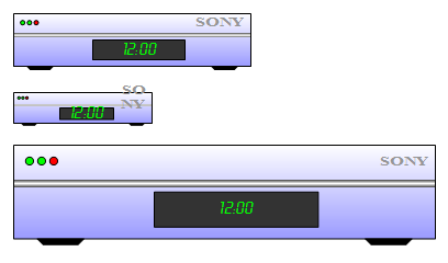
So lets convert these text-blocks into metafiles so that our shape behaves more appropriately!
Make Good-looking Text…First!
By converting these text-blocks to metafiles, or any other vector-based graphic, we can avoid the whole Char.Size ShapeSheet trickery and simply make dumb shapes out of the text. “Dumb shapes” means pure graphics that stretch and resize as they’re told, and don’t try to resist change the way normal text does.
The first thing we need to do is format our text as best as possible. Below, we start out with gray, 12pt, Times New Roman text that says “SONY”. But that doesn’t look quite right. We can stretch the text and make it bold to get a little closer to the actual Sony logo.
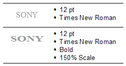
Squish or Stretch Your Text
While bold-ing text should be straightforward, you might not know about character scale and spacing, which can be changed via the Format > Text dialog. If we go to the Character tab, you’ll see that there are two fields for “Scale” and “Spacing”. These options let us stretch or squish the actual characters, and increase or decrease the spacing between each character. While Visio doesn’t have all the fine-tuning tweaks available to proper illustration and text-layout programs have, these two settings allow us to coerce our text into looking a bit closer to the real thing!
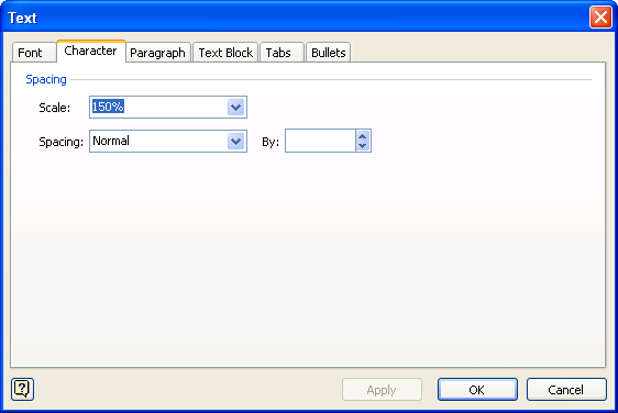
Cool Fonts Are Cool But Not So Cool
To create the digital readout, I installed the “LCDD” font that’s been buried on my hard-drive since 1993. This saves a lot of drawing of (or Google-ing for) digital-number Visio SmartShapes. (…hey, there’s an idea for a Visio Guy article!)
Since we’ll be converting this text into a metafile-shape, we need to first give it a nice green color, because the metafile version won’t be editable in any way other than resizing.

One caveat: metafiles still require the font to be installed on the machine. So I would need to (legally) distribute the “LCDD” font to any users of this shape to have the nice effect. For that reason, it’s best to stick with default Windows’ fonts, or convert text to vectors using a program such as Adobe Illustrator.
Remove Unneeded Geometry
Now that we’ve got our text looking just-so, we’re just about ready to convert it. But for efficiency geeks, there’s one more thing that we should do first. Most text blocks in Visio are actually rectangles that have No Line and No Fill styling. Since we want to create pure-text shapes, there’s no need to bring along these additional, invisible vectors. So select your shape, choose Window > Show ShapeSheet, then look for the Geometry1 section. Place your cursor on any cell in that section, right-click your mouse, and choose: Delete Section. This cleans up the unneeded rectangle!
Convert It!
We’ve done all the prep-work, so all we need to do is copy our text shape, then paste it back using Paste Special. Click the menu: Edit > Paste Special, and you’ll see a dialog like this:
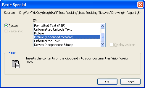
Choose Picture (EnhancedMetafile) and you’ll get your text-shape pasted back as a metafile object. This object will stretch and resize like a shape, and will resize below the 1 pt text limit that normal Visio text has.
After you’ve pasted the text-as-metafile, you’ll need to tweak the size a little bit. For some reason, metafiles get created such that the text is a bit smaller than the original. No problems, though. Just stretch the new shape to the correct size, then place them in the appropriate locations.
Once we’ve resized and positioned our metafile-text, deleted the original text-shapes and grouped everything together, we can test the new versions. Here we can see that our metafile versions behave quite nicely. Both the “SONY” and the “12:00” remain proportional to the shape!
Word Art
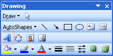
I mentioned creating paths from text using Adobe Illustrator. For Microsoft Office-based users though, Adobe might not be an option. Another trick to getting non-font text is to use Word Art. Word Art is found in applications such as Excel or PowerPoint on the Drawing toolbar. You start Word Art by clicking the tilted, 3D “A” icon:
You can also get to Word Art from Visio by choosing the menu: Insert > Object, selecting Microsoft Word Picture from the list box that appears. You’ll have to then insert a Word Art object into this Picture object. I think that it’s almost easier to create in Word or Excel, then just copy it over.
With Word Art, you can create all sorts of crazy, twisted, warped text. When you’re finished, you’ll have an object that you can copy and paste into Visio. You can even ungroup (via: Ctrl+Shift+U) and get actual Visio shapes that you can edit with the pencil tool!
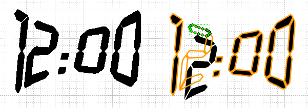
Note that when you ungroup, Visio converts the Word Art object into actual Visio shapes, but it creates two sets of shapes: one set is just outlines, and one set is just fills, so you’ll want to get rid of the duplicates!
Below, we can see the pasted Word Art object on the left. On the right, we’ve ungrouped it to create real Visio shapes. I’ve pulled away one of the “fill” shapes to show that there are two sets of resultant shapes. Clicking on a shape with the pencil tool reveals green vertex handles that prove this is real ShapeSheet geometry!
We could probably argue that the Word Art method is more powerful than the metafile technique described in this article. But I think that converting to metafile is simpler for beginners, and for simple cases much easier to accomplish. Simply cut and paste special!

Thanks. Been looking on how to do this for hours.
I started using VIsio 2 years ago and have been fighting with this for the whole time. Thanks for the great tips.
On Visio 2007 and 2010, Insert > Object, is not listing “Microsoft Word Picture”. How can I put my Word Art in Visio 2007 or 2010 in this case ?
Hi Barry,
Copy from Word or PowerPoint? I don’t know that Visio supports WordArt creation in the first place–can’t remember 100%. Or perhaps you haven’t installed it? It’s probably some sort of “shared Office component”.
But I’m pretty sure I create WordArt object in other apps, then paste them into Visio as metafiles.
Many thanks for this – I knew there had to be an easy way to do this as any Visio shape can be Grouped, Copied, and Pasted into Word, where everything scales. I tried scaling it in Word and pasting it back into Visio, but it was pasted back in original form.
Can you help me get my hands on this LCDD font spoke of by Visio Guy? This would give my work a facelift. THANKS!
Hi Matthew,
This article: ‘Indexed’ Shapes – for that Hand-drawn Look has a link to a free font site. You’ll probably find a few LCD-style fonts there!
Great post on scaling text in Visio. Solves a years old problem for me.
Very cool!!!