 Are you interested in data visualization, presentation and graphical representations?
Me too!
I spent this morning playing around with various visual forms, to see how well they convey information. You might enjoy my mini-study, and like to share your own opinions on the matter!
Circles are Cool, But Circles are Bad
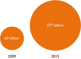
I was reading one of my favorite magazines: Technology Review, and stumbled upon this graph:

The circles are soothing. The orange is bright and happy. There will clearly be a lot of growth between last year and 2015. But do you get a sense for how much growth there will be?
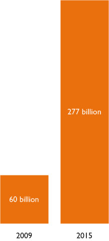
Now look at this bar graph:
 It feels quite a bit different than the two circles, doesn’t it? I was actually shocked by this and checked my math quite a few times!
It turns out that 277 is actually 4.62 times 60. To me, those circles do not immediately impart the feeling of “Four Times More”, but the bars do. Well OK, I don’t actually look at the bars and think “Four Times More”, but I feel like I truly understand the difference between the numbers when I look a the bars, but not when I look at the circles. Do you see it the same way?
Playful Study
I’ve read many articles about data visualization which mention that human beings are not good at judging areas. While there has been quite a bit of rigorous study into the matter, I thought; “No better way to learn than to try it yourself!” So I fired-up my copy of Visio 2010 and created the visual bits you see above and below.
What follows is a playful study–my thoughts and ideas–about the problem of visually comparing numbers. Hopefully you’ll find it interesting and you’ll want to share your own opinions in the comments at the end of the post.
Unit Circles
Since circles are cool, I thought I’d experiment with them a bit more. Here’s another variation of the original graphic:
click to view larger image
You can clearly see that 2015 will yield more than four times as much as 2009. But to me, it almost looks like 5. At first glance–without thinking or analyzing–it looks like 4.8 or 4.9 to me.
Since the whole point of data visualization is to relay accurate info with little effort on the reader’s part, I don’t like graphics that force me to figure them out. I think the stacked circles would probably work best for comparisons of round numbers. The fractional circles don’t work well.
Bar Fatness
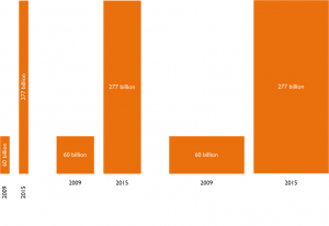
Back to bars. What about the thicknesses? Does the fatness of the bars also influence your perception?
To me, the fatter bars seem to de-emphasize the difference, but I’m not really sure. Perhaps it is that bad-at-area-estimation human trait at work again? What do you think?
What about the labels? The left-most, skinny bars have vertical labels and vertical text. Does that read your eye astray?
Height vs. Length
What if we change the orientation of the bars as well as the thickness?
If you’re reading this article, you’re probably used to reading left-to-right. Maybe horizontal bars are more comfortable to look at. But I feel like it is more natural to compare vertical heights than horizontal lengths. That might just be me.
I recall reading about perceptual differences between length and height. I don’t want to go and look for that information now, but if you want to share a link, please post it in the comments below. Right now, I find the horizontal bars comfortable to look at, but I feel like the vertical bars give a better sense of the numerical comparison. Am I being influenced by mis-perceptions and human weakness?
Again, I think the fat horizontal bars de-emphasize the difference in the quantities. The thin bars are clearer to me.
I also wonder if the spacing between the bars has an effect on perception?
Single Columns
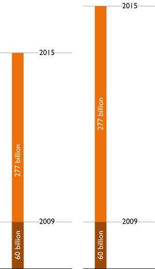
The next variation puts both quantities in the same bar, so there’s no worry about fatness or spacing:
I think the only danger here is that it might not be clear that the “277 billion” bar also starts from the ground. I tried to make the black line at the bottom a bit thicker and more definite to give a feeling of Earth or Ground, but I’m not sure if it is clear. This is a problem with stack graphs that I have seen. Are the different colors all starting from zero, or are they piled on top of each other?
Overlay vs. Stacking
Here we can see the difference between both bars starting at zero, and when they are stacked on top of each other:

Another variation on the single column approach adds subtle “unit lines” to help in gauging multiples of one quantity over the other:
Again, we have the are they stacked or do they both start from zero problem.
Offsets and Unit Ticks
To alleviate that, we can offset the bars slightly, without making the graphic too visually distracting:

I like this version. It’s clean, easy to understand, and has some extra bits of info from the unit tick marks. You can easily compare the values, and people who want to be able to say; “Oh, 2015 will be 4.6-ish more than 2009!” get that extra bit of help, without too much distraction.
What do you think about all of this? Share your opinions and ideas in the comments section below. And if you have any interesting links to other articles and research on related topics, we’d love to have them!


I like your first bar graph the best.
I am not sure saying 277B is 4.62 times 60B is the best goal to represent. Another way of making the comparison is: from 2009 to 2015 there is an expected 361% increase, or a yearly 29% increase. My initial reaction would be you do not need a visualization to tell that story. If there was more data available, like where these numbers came from, then there might be a story to tell with a visualization.
In your last viz, I would recommend switching the labels, placing the year as the white text on the bar, and the amount measured in black as the reference lines.
If you are interested in quantitative analysis, I would recommend Stephen Few’s book “Now you see it“
Good article. I prefer the last viz with the changes recommended by Joe Mako.
Thanks for the critique, guys!
For those interested in why circles can be bad for data visualization, I just found this article by Stephen Few of Perceptual Edge:
Our Irresistible Fascination with All Things Circular
I think I got there via Joe’s site, by the way!
Wonderful article… I like the last one better. Offsets and Unit Ticks
I like the first bar chart as well. KISS.
Time is best (IMO) represented by a line, i.e. left older, right newer. Stacking them up isn’t very helpful.
I have some budget vs actual reporting to do and plan to build a shape, so thanks for the article.
Thanks for stopping by and commenting, everyone!
I prefer the first bar chart. Circles do not offer in this case the best message.