 If you’ve ever created pivot tables in Excel, then you’ll want to see how you can create Pivot Diagrams in Visio 2007 Professional.
Visio lets you drill in and roll up the data to understand structure and hierarchy the way we were meant to understand it: visually!
This guest post and content was created and written by David Edson. David is a fellow Microsoft Visio Most Valuable Professional (MVP), a one-time co-worker of mine at Visio Corp., and is currently the CTE/Director of Consulting Services at visibility.biz.
Introduction
If you have ever created a Microsoft Office Excel 2007 Pivot Table you will understand that they are (a) very powerful indeed, and (b) less than intuitive and more than frustrating to create in the first place.
With the introduction of Microsoft Office Visio 2007 Professional, the Visio development team created a new, and FAR easier way to “slice and dice”– to visualize complex data sets in an intuitive and visually appealing manner.
Visio Pivot diagrams are the visual alternative to structured, yet still tabular data as shown in Excel. Visio Pivot Diagrams allow you to visually “Drill In” and “Roll Up” data and understand structure and hierarchy. The old adage that a picture is worth a thousand words can easily be extended to be “a single hierarchal diagram is worth ten thousand grid-like cells”.
So let’s look at how Visio Pivot Diagrams are constructed and how to work with them to maximize the understanding of the underlying data. We’re going to do this in a relatively few number of steps, and without the headache of the overwhelming set up required for those Excel Pivot Tables.
So… roll up your sleeves, fire up your copies of Excel and Visio, and let’s get comfortable with the power of Visio 2007 Professional Edition Pivot Diagrams.
Note: you can download the Visio and Excel files that accompany this article at the end of the post…you know, way down there, at the bottom!
The Data Set
Before we can begin to visually analyze data we, obviously, need data to analyze in the first place. I’ve created an Excel workbook, FinancialMgtDataSet.xlsx, with a single worksheet tab in the workbook. The Worksheet has eleven columns of data. The table below lists the columns of data we are going to use:
| Excel Column | Data Column Header | Understanding of the Data contained in the Data Column |
| A | EmployeeNumber | A unique number identifying each employee |
| B | EmployeeName | The Name of the Employee |
| C | Department | The name of the Department that the employee works in |
| D | EmployeeManager | The Name of the Manager that the Employee reports to |
| E | PerformanceCumulative | The cumulative performance rating on a scale of 1 to 5 |
| F | PerformanceCurrent | The current performance rating on a scale of 1 to 5 |
| G | SalaryCurrent | The current annual salary for the employee |
| H | BonusOffered | Has the employee been offered a bonus 0=NO, 1=YES |
| I | ClientLoad | The current number of clients the employee is managing |
| L | PortfoliosManaged | The total number of portfolios the employee is handling |
| K | RevenueInstream | The total revenue being derived this year from all portfolios being managed by the employee |
You can either simply use the data set that I have provided or create your own data set to be used as part of your learning how to create and use Visio Pivot Diagrams. My data set has 19 records. Yours can contain as many or as few as you desire. In order to fully understand how this hierarchical data can be analyzed you will want to create a data set that has at least three managers which have (n) number of employees reporting to them. Look at the data set I’ve provided and use it as a guide to creating your own.
Here’s a peek at the data:
click to view larger image
Once you have a data set created in Excel (or in Excel, Microsoft Office Access, Microsoft SQL Server, or actually ANY OLEDB or ODBC-compliant data source), take a good look at your data.
If someone asked to quickly identify which employees were overburdened in their case load, or which managers need to boost their employee’s performance rating with extra attention and training, could you make a decision based on the flat columns and rows in a grid?
Perhaps you can, however a Visual representation of the structure of these employees and their performance and workload criteria would be FAR more conducive to rapid analysis. With this data set in place and saved to our local machines, we are ready to begin creating the Visio Pivot Diagramme representing this data morass.
Initial Pivot Diagram Creation
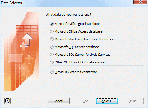
Go ahead and launch Microsoft Office Visio 2007 Professional edition (Visio 2007 Professional edition is required to create and work with Pivot Diagrams). In the Getting Started environment, select File > New > Business > PivotDiagram (US units) from the Visio File Menu. This action will display a new blank Visio Pivot Diagram as well as launch and display the Visio Data Selector Wizard (This is exactly the same wizard, screen for screen, that you would use to connect data records to Visio diagrams with Visio 2007 Professional data connectivity. The only difference is that the Pivot Diagrams can also connect to SQL Server Analysis Services.).
The first screen of the wizard asks us to select the type of data store we are trying to connect to. We can connect to: (a) a Microsoft Office Excel Workbook, (b) a Microsoft Office Access Database, (c) a Microsoft Office SharePoint Services list, (d) a Microsoft SQL Server Database, (e) Microsoft SQL Server Analysis Services, (f) or other OLEDB or ODBC Data Source.
We’ll choose the Microsoft Office Excel Workbook then Left-click the “Next >” Command Button to advance to the next screen of the wizard.
The second screen of the wizard asks us to specify the specific workbook that we want to use as the data source for the Pivot Diagram. We’ll Left-click on the “Browse…” Command Button navigate (with the File Selection Browser Dialog) to the Excel Workbook that we created above, and Left-lick the “Open” Command Button to return to Screen Two with the path and name of our Excel Workbook filled in, in the Text Box. We’ll then Left-click the “Next >” Command Button to advance to the next screen of the wizard.
The third screen of the wizard asks us to choose the particular Worksheet or Defined Range that we want to use for our data source. In my sample data set, I deleted all worksheets but the first and renamed the single worksheet to “PerformanceToCompensation”. Yours may differ, however the default setting you encounter will most often be fine. We’ll next Left-click the “Next >” Command Button to advance to the next screen of the wizard.
The fourth screen of the wizard asks us to, if we so desire, filter the columns and rows of data that we would like to import. In our case, we simply want to import everything so we will just Left-click the “Next >” Command Button to advance to the next screen of the wizard.
The fifth and final screen of the wizard simply asks to confirm our selections by Left-clicking the “Finish” Command Button. This action will (a) confirm our choices and close the Wizard, and (b) create a single Top-Level Node in the Upper-Right-Hand-Corner of our Visio diagram. It will also turn off the Grid display, if it is active, in the Visio diagram.
Looking to the Left Side of the Visio Drawing Window we can see that the Pivot Diagram Task Pane is displayed:

In the Pivot Diagram Task Pane we can see three sub-panes shown: the “Add Category”, the “Add Total” and the “Actions” sub-panes.
The Add Category sub-pane lists all of the data columns that we created in our Excel Data Source (Note that if we were to Right-click on the Top Level Node SmartShape symbol, we would have this exact same list on the SmartShape symbol’s context menu).
The Add Total sub-pane lists different text display items to be shown on the face of the particular Node SmartShape symbol. In our case, based on the data set we created in the Excel Workbook, we can note that the “PerformanceCumulative(Sum)” value is being displayed on the SmartShape symbol and the corresponding Check Box is checked in the Add Total sub-pane. Try checking and un-checking any one or several of these Check Boxes and note the data which is displayed on the face of the Node SmartShape symbol.
Adding “Drill Down” Categories of Data
Like Excel Pivot Tables, we want to “Drill In” on specific criteria to understand the breakdown of the data we are analyzing. The choice is yours whether you prefer to Left-click on a Category in the Add Category Task Pane or Right-click on the Top Level Node SmartShape and select the Category from the Context Menu.
Either way, let’s break down the data by Department to analyze the performance data on a department-by-department basis. When we’ve made the selection by adding Department (based on my data we will have the “Aberdeenshire”, the “Banff and Buchan”, and the “Midlothian” departments), we can see the data now displayed with a top-level (Grand total) and individual department totals. We can repeat this process as many times as we wish for any criteria we desire.
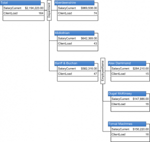
Here, for example, we can easily see that the highest-paid department has the highest client load, and the lowest paid as the lowest load:
click to view larger image
We can also “Roll Up” a level of displayed nodes at any time we wish by Right-clicking on the parent node of the nodes we have Drilled In to and select “Collapse” from the Context Menu, or by Left-clicking on the desired Parent Node and then Left-clicking on the “Other Actions” Drop Down Command Button in the Actions sub-pane, and Left-clicking “Collapse” from the Menu List. Go ahead and try “Drilling In” and “Collapsing” to “Roll Up” on several categories and observe the results.
Modifying the Layout Direction
Notice that, by default” when the Pivot Diagram created new Nodes beneath the Parent Node, it lays them out in a purely horizontal manner. We have the choice to display them horizontally or vertically in their layout per our desire.
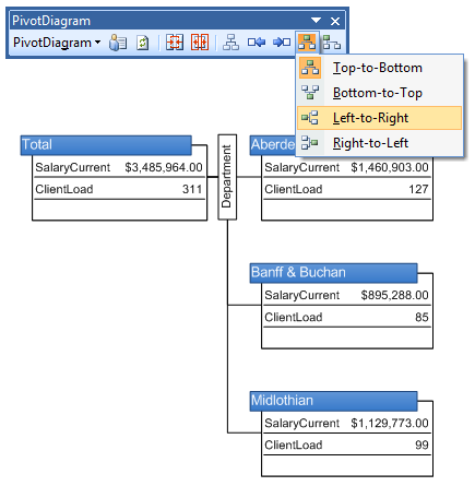
To accomplish this task, we Left-click to select the Parent Node of the Nodes we want laid out, then select Pivot Diagram > Layout Direction > Top-to-Bottom to lay them out horizontally, or Pivot Diagram > Layout Direction > Left-to-Right to lay them out Vertically. (I know this is contrary to any logic we have tried to wrap our collective heads around, however just accept the logic and you will escape without benefit of headaches and ulcers).
Here, we’ve rearranged the chart in the “Left-to-Right” style:
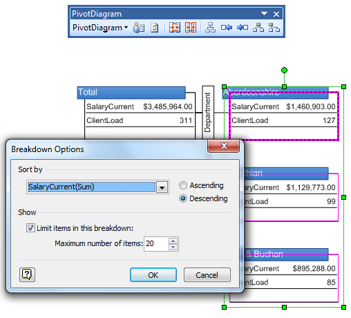
We can also change the sort order of the items in the expanded nodes by selecting all of the Nodes we want sorted and then selecting Pivot Diagram > Sort from the Pivot Diagram Menu. The Dialog that appears will allow you to sort in an ascending or descending manner based on several criteria.
Here, we’ve put the money people at the top, sorting by cumulative salary:
We can also filter the Node Items we want displayed in the diagram at any level by Right-clicking on the small Category box between the Parent and Children nodes, and selecting “Configure Column…” from the Context Menu. For example, where we have expanded on the “Department Category, we Right-click on the small “Department” Category box in the Diagram, and select “Configure Column…” from the Context Menu. In the Dialog that is displayed, enter the filtering criteria and then Left-click on the “OK” Command Button to confirm the choice and close the Dialog. The Pivot Diagram will be updated to reflect this filtering criteria.
Here we’ve drilled down into the Banff and Buchan department to show individual employees:
click to view larger image
And here we’ve filtered for Client Load less than 17:
click to view larger image
Modifying the Displayed Information on the Nodes Using Data Graphics
The information(Data and Labels) displayed on the face of all of the Nodes, as we have seen, is determined by the selection criteria from the “Add Total” sub-pane. However, often we will want to have differing information displayed at differing levels of the hierarchy in the Pivot Diagram.
To understand how to modify this to suit our purposes, we first need to be aware that the information being displayed is displayed in that particular manner based on Visio 2007 Professional’s Data Graphics. By default, the Data Graphics Task Pane is not shown, however we can display it at any time by selecting Data > Display Data on Shapes… from the Visio Data Menu. This action will display the Data Graphics Task Pane at the Right of the Visio Drawing Window.
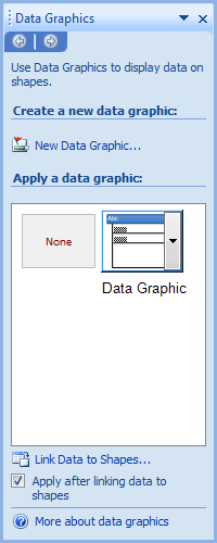
Note that in the Data Graphic Task Pane, in addition to the “None” item, there is a single Data Graphic item shown. If we float the cursor over this item it will display its name, in this case “Data Graphic”.
Before we create additional Data Graphics, we need to rename this default Data Graphic. To do this we simply Right-click on the Data Graphic named Data Graphic and select “Rename…” from the context menu. I tend to rename mine “Default”. Once this default Data Graphic is renamed, we then want to create a copy of this Data Graphic. We do this by Right-clicking on the, now, “Default” Data Graphic and selecting “Duplicate” from the Context Menu. It will have a new name which may be similar to “Default.10”. We can rename this new duplicate to “Client Load” in a manner similar to that as above.
Next we will want to modify the items to be shown in this new Client Load Data Graphic / Node Display. Right-click on the new “Client Load Data Graphic” and select Edit Data Graphic… from the Context Menu. In the Edit Data Graphic Dialog, select the drop-down list item listed as “PerformanceCumulative” and replace it with a selection of the item “ClientLoad”. Left-click the “OK” Command Button to confirm the change and close the Dialog.
Now that we fully understand how to expand Nodes in a Pivot Diagram, ensure that:
- Top Level Node is expanded by Department
- Banff & Buchan Node is expanded by EmployeeManager
- EmployeeManager Graham Eads is expanded by EmployeeName
The EmployeeName item (using my Data Set) should be Alex Darrimond. Left-click to select the Graham Eads EmployeeManager Node.
Now Left-click on the new “Client Load” Data Graphic. This applies the data graphic to selected shapes. Notice that the Text / Data on the Graham Eads node has changed to reflect the actual Client Load for Graham, while the Performance Cumulative assessment is still displayed on Alex’ Node.
In a similar manner we can duplicate any number of Data Graphics, Rename them, and Edit their Data Fields to reflect the Data we want displayed on any given node or number of nodes. We can multi-select any number of nodes and apply the Data Graphic we desire for those Nodes. As we understand the four types of Data Graphics (Text Callouts, Data Bars, Icon Sets, and Color by Value), we can create any number of highly customized Data Graphics and freely apply them to any one or any number of Nodes in our Pivot Diagrams.
Here’s a shot of another Data Graphic being edited: “Salary vs. Performance”:
click to view larger image
Massaging the final layout
The Pivot Diagrams do not always lay out in exactly the desired spacing, even when we alter the layout direction. Therefore we need to remember that we can, at any time we wish, manually move nodes around to suit our needs and deliver the exact look and feel that we want in our diagram.
NOTE: remember to perform your final locational massaging AFTER applying all changes to the Data Graphics on the desired nodes. Altering Data Graphics AFTER manually relocating nodes can cause erratic behavior, and simply force you to relocate nodes all over again.
Conclusions
Well there we have it. Soup to nuts, as they say. We are now fully qualified to create a data source, populate that data source with data, create a Visio 2007 Professional Edition Pivot Diagram and get it to display in a clear, concise manner all of the rich data we build. As we can see this is MUCH easier than Excel Pivot Tables!
End users, and their Management will truly appreciate the clear easy-to-understand manner that Pivot Diagrams present the data.
Enjoy!
Download “Pivot Diagram Primer Files”
s!Aj0wJuswNyXlhwkiCX3EpJCGNDRI – Downloaded 3635 times – 103.00 BIf you’d like to see more on Visio pivot diagrams, check out this video!





The data selector wizard doesn’t appear when I open the pivot diagram template – is there a way that I can access the wizard manually? Thanks,
Hi Samori,
Are you using Visio Professional or Standard? I think that the Pivot Diagrams are only available in Visio 2007 Professional, not Standard.
Good article for sure. Now how do you remove a pivotdiagram once you have inserted one into an existing page?
Hi Visio Guy!
I have a pretty complex set of data in Excel, using APQC framework, showing process flows within an area of our business today. We then have a version of that same data, simplified, and drawn in Visio (manually).
Our next step is to take the ‘as is’ Excel APQC document that reflects today’s processes, and update it to reflect what we want our streamlined, standardized go-forward processes to look like. Once that is complete, we have to create the updated Visio document, but with much greater detail this time around.
I know that the interface between Excel and Visio can provide some pretty complex outputs. However, to-date I’ve not found much on the web that indicates how I can use our current Excel data to create a Visio output with ‘if/then’ considerations, etc. Until I found this article on your site….
I’m on Windows Vista, using Office 2007 (Excel 2007 & Visio 2007). Is there a better article you can point me to that may help point me in the right direction?
Thanks for all the information on this site. What a WONDERFUL repository!
Regards,
Angela
I have tried a few different ways and can’t seem to get my numeric data to behave as a Total. Visio is trying to make numbers like Invoice Amount a Category! Some other numeric columns in my Excel spreadsheet are in the Totals section as you would expect. I have tried basically making it into a CSV (no formatting at all), tried formatting each column as a number or accounting in Excel, and even pulling from a database (which inherently has data types). Any idea how I can force Visio to treat a column as numeric for summing, averaging, etc? Driving me insane!
Hi Matt,
Bummer to hear about your difficulties. I don’t use the Pivot Diagrams myself very often, and unfortunately I don’t have any spare time to look into it in the near future.
Hopefully somebody else can chime in and help.
Thanks in support of sharing such a good opinion, post is
fastidious, thats why i have read it completely
Hi there! I know this is kinda off tolpic but I was wondering if you knew where I could
get a captcha plugin for my comment form? I’m using the same blog platform as yours and I’m
having problems finding one? Thanks a lot!
Feel free to surf to my website … getting more views on youtube
You are so cool! I don’t believe I’ve read a single thing like
that before. So wonderful to discover someone with genuine thoughts on this subject matter.
Seriously.. thanks for starting this up. This site is something that’s needed
on the internet, someone with a little originality!
Here is my webpage; Mademoiselle Julie Télécharger
hey nice tutorial but i got one qeiotusn and would be nice? if you can give me the solution for it here is the qeiotusn: is there any possible way to make self updateable pivot table like if i update something on main table to be visible in pivot table if so pls give answer on mail here tnx alot btw