 I was reading What goes up, must come down! on the Sankey Diagrams blog and it got me thinking about a radial presentation for Sankey diagrams.
Is there a case or need for radially-oriented Sankey diagrams? Is this something the world needs?
Sankey diagrams are great for showing relative flows by incorporating arrow-thicknesses into the graphics. While they often show a process from “start” to “finish” by flowing from left-to-right or top-to-bottom, they have the flexibility to show other data, such as specific dates (History of Parties and Armies) or geographical position (Minard’s famous “Napoleon’s March” Sankey)
They can also illustrate feedback or regeneration by having arrows loop back on each other, sending output flow back in to previous processes. This isn’t a problem with the Sankey diagrams that are out there.
So I’m wondering if there are processes that are so circular-oriented or so “feedbacky” that they would be better illustrated by wrapping the Sankey concept around a circle?
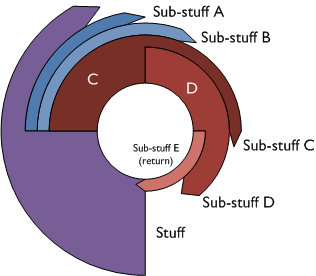
Here are some prototypes that I came up with:

“Everything Radial” Circular Sankey Diagram
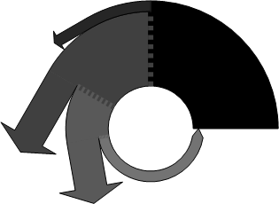
The second idea made a point of having arrows come off tangentially. I think this view is a bit more clear. Only arrows feeding back to the start remain as in the first example.

“Tangential Fly-off” Circular Sankey Diagram
While I did create these with Visio, the process is still manual and cumbersome (translation: there’s no download!) But perhaps someday there could be Visio SmartShapes (and code?) to create such diagrams.
I’d be interested in hearing your feedback. You can leave your input in the comments section at the end of the article. Some questions to ponder:
- Have you been looking for this type of diagram?
- What features would you like to see?
- What kind of data would you show with a radial Sankey diagram?
- What processes would fit best with this diagram?
- Which of the above layouts do you find the most pleasing or useful?
- What would you change?
- Have you ever needed to create this kind of diagram? (Or wished you could have?)

Looks like a solution looking for a problem!
I am wondering if it might be possible that the arrows point away from the center? For a process that radiates heat or energy, this could show this in a nice way.
Tangents would be good for a process that is really rotating.
g
About the only thing I can think of using them for is if you have a couple of different outputs from one central process and want to keep things neat.
Not a solution looking for a problem, on the contrary this is a very useful idea. Many years ago, I used to do some work for a cigarette company that was making their own 10 cigarette packs, the kind where there is an outer sleeve and the drawer containing cigarettes slides from either end.
They could start with plan card stock and over 10 steps like printing, trimming, etc arrive at the final pack. At each stage of the process they had some wastage and they would track this wastage regularly. Similar situations exist in many industries and it is good to know where everything is going.
Also from a financial analysis perspective financial analysts want to know what is being spent on various aspects of a business. We would do this using a bar graph or a pie chart. It would be a great idea to see using circular sankeys. I think the width of the arrow is a better visualization of the amount being spent rather than a slice of a pie.
Regards
I like the general look of the radial layout, especially if it is reflecting a rotating or looping process.
One could also depict information based on the arc-length of an arrow (like pie charts do with sector-size). Distance from center could also have meaning.
One potential problem is that as you move out from the center, arrows of the same thickness and arc-length will have a lot more area further from the center than nearer. Such perceived “bigness” can be a problem when trying to accurately depict information.
– Chris
Looks like a solution looking for a problem!
What an interesting idea.
A few potential applications come to mind.
The most obvious are recursive industrial processes, where outputs are fed back into the system. Engines (turbocharged, turbofan) come to mind– what one is trying to understand in analyzing a system like this is how performance varies with the degree of feedback. Cogeneration also roughly fits this paradigm.
In financial models, the radial paradigm would be a neat way to represent reinvestment
There are a lot of biological processes which are described with radial paradigms– the most celebrated is probably the Krebs’ Cycle, but there are lots more.
One more: stellar nuclear reactions
The Bethe-Weizsacker cycle (or “C-N-O” Cycle) for example
http://en.wikipedia.org/wiki/CNO_cycle
This and the previous three that I mentioned above more or less demand a circular approach. Unlike Napoleon’s Army in Russia, there’s no “beginning” and “end” — these cycles are essentially continuous (until they exhaust fuel or whatever), so the the Minard-style Sankey diagram is less appropriate than a circular one.
Thanks for the great comments, Alexander!
Do you think the circular outlay would cause any misrepresentation in the graphic?
For instance, if we have two arrows or paths of the same thickness, the outer one might look bigger because it has a longer path and therefore more area.
I suppose outer paths could be made shorter using automated calculations.
There are so many bad graphics in the world that make misleading comparisons (like elliptical pie charts!) We don’t want the guys at Junk Charts or FlowingData to jump down our throats! 🙂
“Do you think the circular outlay would cause any misrepresentation in the graphic?
For instance, if we have two arrows or paths of the same thickness, the outer one might look bigger because it has a longer path and therefore more area.”
——————————————
In a recursive process like, say, stellar nuclear reactions or the Krebs cycle, you have to think carefully about how you use area, and you might add some novelty and cleverness to the “state of the art” here.
Sankey diagrams use line thickness to represent quantities– in recursive processes, the process quantities are going to be tiny compared to the available feedstock (eg, nuclear reactions in the sun will take 6 billion years to convert the sun’s hydrogen supply to helium). So if you did everything to scale, you’d either get a vanishingly thin line (for helium output relative to hydrogen stock)– or you’d create something misleading.
I think it would be interesting to explore the the idea of representing the central cycle without scale, but use the line thickness for the scale of the inputs and the outputs.
It bears some thinking about, and I think the best answer will depend on the specific process one is trying to illustrate, and their scale.
There is no obvious “right answer” to your question, not to me, anyway.
For certain! Radial diagrams would be great. It’s exactly what I want to show an itterative process that repeats until approval is achieved. I love your radial n arrow circle thingies. I just need one of the arrows to split so I can either continue to refine the process, or if I succeed I can graduate out of the loop.
While I may have built this manually in a past life, now that I’ve discovered your cool pre-builts I now expect my every whim to have been anticipated and and incorporated into a nice little package.
I agree, this isn’t a solution looking for a problem, I have that exact problem and I would LOVE a solution like this.
Dahn
I would very much make use of radial sankeys. That is how I stumbled on this page. I am a marine system scientist and I am making several charts for biochemical cycles in bays and oceans. Much of the processes are cyclic with feedbacks and weights. Research articles present this information in flow boxes but it’s cumbersome and messy. I have several I have made from the ‘weighted line’ example you posted but it’s tedious and time consuming.
Hello, I see this thread is rather old, however, I would like to help build a node graph whose edges are radial sankeys.
A good visualization vehicle is a power distribution graphic for an electronics system.
Input Power is a process whose “weight” is proportional to the power draw at that stage. (Power Transmitted + Power Consumed). Subsequent stages draw from the input stage with the same transmission/consumption rules.
An algorithm that would drop process shapes as nodes in the visio canvas would be required. A spreadsheet would drive the power parameters that determine the relative “weight” of the sankey edge connections.
The drawing would benefit from bending of the sankey connectors out to the star nodes. If the connectors new the power consumer connection points, then the algorithm would need to connect them nicely to the source node so that they don’t overlap.
Since the power is finite and well determined, the arclength of a source node should nicely match the collective widths of the consumer nodes normalized to avoide the full 360 degree outburst.
It seems that with a smart arrow and some help from the elegent circular pattern smart shapes that all that is lacking is a “NodeXL” add-in for visio, “NodeVz.”
Thanks,
Nick
Might be interesting to see a version of this idea where a lot of information flow converges.
Imported goods
Vacationing tourists
Ingredients in a recipe
Bank deposits
Team member contributions
Just a thought 🙂
Can to describe what’s of the Sankey diagrams simply